Tag Archives: old internet sites

Net Art Resources | Why I Miss the Early Internet

Following up from my article “Why I Miss the Nineties Internet” here are some useful resources if you’re interested in getting involved with creative coding in the net art space or want to take a look at some old school websites for yourself.

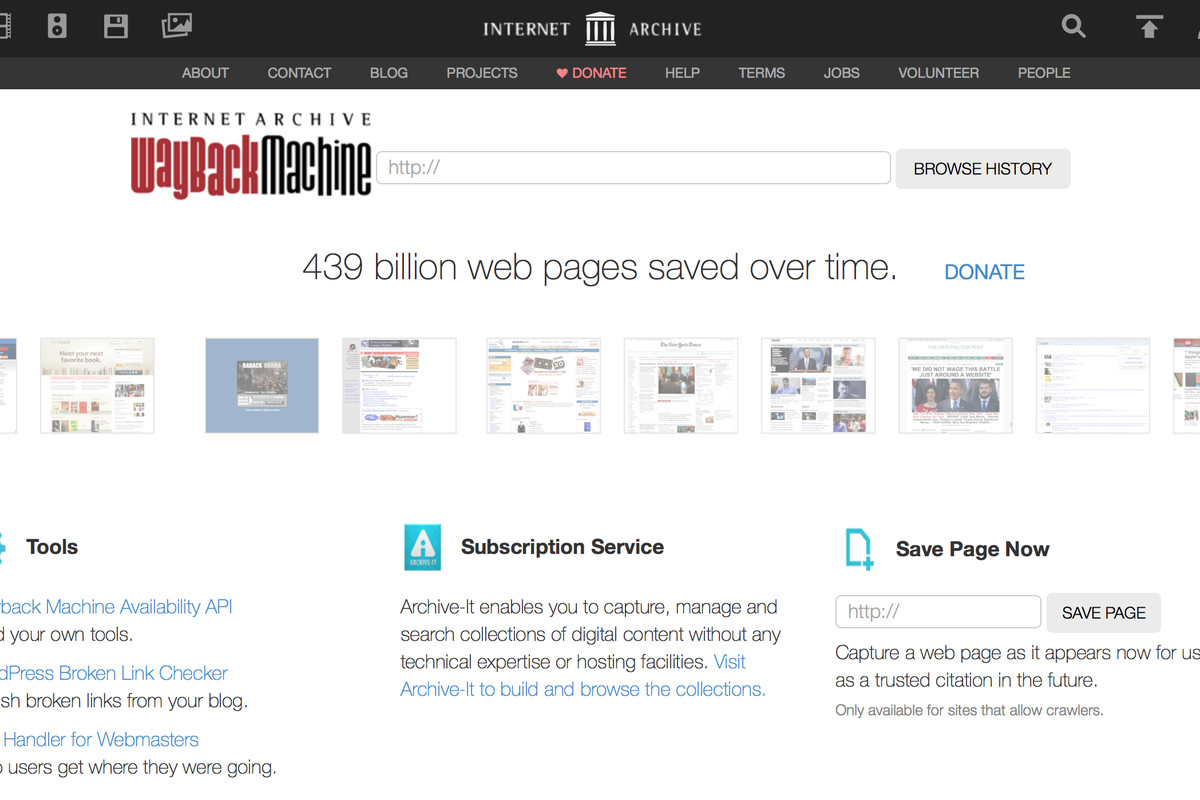
https://archive.org/web/

The Wayback Machine allows you to search URL’s from the past and see screenshots of old websites. It’s an impressive archive.

http://oldweb.today

Similiar to the Wayback Machine but appears to retain some interactivity as opposed to simply a screenshot of an old webpage. Actually simulates the browser window.

https://www.webdesignmuseum.org

Web Design Museum has screenshots of many of the early versions of major corporate sites like Paypal, Netflix, and Apple.. but it also has tons of lesser known websites that really show the range of design experimentation that was happening in the 90’s and early 2000’s. It’s a great source of inspiration for artists who want to draw on that sense of old internet nostalgia.

http://rhizome.org/program/

Rhizome is a hub for digital artists who work with the web. It was founded by Mark Tribe when artists were just beginning to experiment online and has an impressive archive. There are tons of creative coders featured on this website who combine art and technology in unique and fascinating ways.

http://networkcultures.org/blog/publication/no-12-variant-analyses-interrogations-of-new-media-art-and-culture-patrick-lichty/

I had the pleasure of meeting Patrick Lichty in person when I was in college. Lichty has been practicing with digital media long before I was born and wrote these insightful essays on how digital art has evolved from the very early days.

http://www.teleportacia.org/war/

A classic piece of net art “My Boyfriend Came Back From The War” was made back in 1996 by Russian artist Olia Lilinia.

https://ristar.itch.io/secret-little-haven

Made by Victoria Dominowski, this is another game that draws on nineties internet nostalgia, but focused more on the AOL chatroom aesthetic. Even the name “safe little haven” reminds me of how I felt about my computer back then.

I hope you find these net art resources useful! Are you inspired to make an experimental game? What do you think of the internet of the nineties? Do you have a favorite artwork or game among those which I shared? Any ideas of your own about how to improve the internet and make it a better place? Please share your thoughts in the comments below.

If you enjoyed this article, consider following me on Twitter @nadyaprimak or if you need more tips on breaking into the tech industry, you can read my book “Foot in the Door”.
Why I Miss the Early Internet: Part 2

This is a continuation of “Why I Miss the Early Internet: Part 1”.

What can we do to revive the experimental attitude that prevailed in the nineties internet? We can do is form our own community of web experimenters who draw upon the nineties internet for inspiration. There are artists today who leverage our nostalgia for the nineties internet and create experimental games and other media which bring back that sense of wonder and mystery that used to be all over the internet. Artists who capture magical moments where you stumble upon something that resonates with you completely unexpectedly, like an explorer in the wilderness. My personal favorite artist who makes work like this is Nathalie Lawhead.

You can find most of her work, which has been described both as art and as experimental games, at her itch.io page. Much of Nathalie’s work draws on the psychedelic, strange, and surprising aspects of the early internet. Her color palette is bright and minimalist, her characters cartoonish and bizarre. In some of her work, like “Everything is going to be OK,” Nathalie evokes the feeling of an nineties desktop computer display, with the low resolution application icons and abstract background.

A screenshot from Nathalie Lawhead’s game “Everything is going to be OK”

As you click on each application you are presented with little vignettes that are very personal to Nathalie’s life. The nineties internet aesthetic fits the subject matter perfectly, because it is fragmented, sometimes difficult to understand, and demands the full attention of the user. It is both mysterious and fascinating, and rewards users who take the time to explore the interface for hidden secrets, taking on the explorer mentality I mentioned earlier.

I don’t want to describe Nathalie’s work in too much detail because she does it better herself than I ever could, and she has plenty of content describing her work, both on her blog and on youtube. If you have any interest at all in making experimental games or interactive experiences, I highly recommend checking out her stuff.

Another screenshot from “Everything is going to be OK”

Hopefully by now it makes sense why learning about the early internet is not just for historians and nerds. Artists like Nathalie and others draw upon the nostalgia and use it to create fantastic experiences that are both unique and compelling. I hope this article motivates people to explore more digital content that draws upon old internet tropes.

If you’re interested in creating your own net art or experimental games and looking for some additional resources, check out my follow up article.

If you enjoyed this article, consider following me on Twitter @nadyaprimak or if you need more tips on breaking into the tech industry, you can read my book “Foot in the Door”.

Why I Miss the Early Internet: Part 1

I was born in 1991 so I feel like I got the tail-end of the wondrous, strange, and experimental world of the early internet. Yet even though I was a kid and even though the internet is a lot more accessible now than it used to be, I still long for the days of the nineties internet. It really felt like the wild wild west back then, with each new website I encountered like finding a unicorn while out on a stroll. I think even the inaccessibility made it feel like a more magical place. Let me explain why.

It wasn’t so simple as just turning on your computer and clicking on your browser icon. Maybe it was also because I was just a kid, but I imagined that awful dial-up tone as the sound of the data traveling thousands of miles and connecting to other computers in far-away places.

The most popular browser of the nineties was not the most glamorous

I visualized how the data would travel into the telephone and across all the poles I would see outside when my parents drove me to school, like a squirrel racing across the wires. At the time I really believed it to be a kind of magic, that if I broke apart the computer I would uncover some kind of little fairy behind the screen.

In some ways today’s internet is better, of course. The field of user experience did not even exist in the nineties, and there were no standards defining what made a site easy to use. Even worse, there were no screen reader tools or really any tools that allowed people with disabilities to use the internet.

A homepage for a game developer from 1996

Yet I think something was lost with the new era of user research and user experience, along with all of the CSS frameworks like Bootstrap which homogenized the web design landscape. These days most websites look very similiar, and people are afraid of straying from the popular styles. I think this is a bit tragic, because there is a lot less experimentation, almost like people have given up creating anything new on the web.

For artists I think the modern internet is especially challenging. Everyone is scrambling to share their work on Instagram, Twitter, Facebook, and that’s only the popular social websites. When you start factoring in blogs and portfolio sites and other creative communities the numbers become staggering. Creative types just getting started in their career have a hard time getting noticed unless they carve out a very specific niche for themselves. The problem with niches, just like the problem with the current homogenized web design of the modern web, is that it also takes away room for experimentation.

Geocities was a popular platform in the time period, with lots of moving images, background music, and general psychedelic vibes.

Sometimes I like to ask myself theoretical questions about where the internet might be today if things had gone differently. What would happen if Google was only one of several popular search engines? What if the internet had gone a totally different direction, or remained the domain of early adopters and academics rather than becoming a mainstream commodity? What would an internet that was not dominated by corporate entities look like? What would an internet made for digital artists look like?

While technically from 2001 and almost impossible to read, this website illustrates just how experimental people used to be on the web.

Of course, all of this might seem terribly pointless to ponder. Sure, you might be thinking again, it’s interesting to consider these questions, but what can we do with this information now? We cannot turn back the clock on all of the UX research nor can we persuade corporations to stop offering their services online. Most of us rightly wouldn’t want that to happen even if it was an option, because accessibility for disabled folks and shopping online are things that we appreciate.

This is Part 1 of a two part blog series. Check out Part 2 here where I talk about artist Nathalie Lawhead and how she leverages the nineties internet aesthetic today.

If you enjoyed this article, consider following me on Twitter @nadyaprimak or if you need more tips on breaking into the tech industry, you can read my book “Foot in the Door”.