How to Make a Poetry Bot

A while ago I published a post about how I used Spell, a machine learning framework that allows you to train your models faster without the pain of dependency management on your machine, to implement a style transfer. I’ve continued to use Spell, and have expanded into exploring other training models. In this post I’m going to show you how to make a poetry bot.

Today I wanted to write about making your own text bot with Spell. I’ve always been a huge fan of Emily Dickinson’s poetry. I know some find her work a bit morbid, but her poetry has spoken to me throughout many years and I continue to marvel at how someone who rarely left her home could have such incredible insight into the human condition, the natural world, and the realities of life and death.

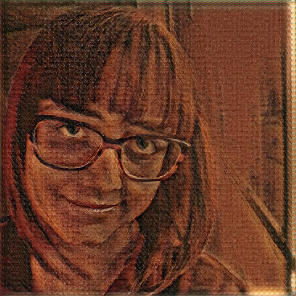
A portrait of Emily Dickinson, the famous reclusive poet

Since Spell conveniently had a video tutorial for creating a bot trained on lyrics from DOOM, I figured I could apply this quite easily to Emily Dickinson’s poetry.

Surprisingly for me, the hardest part was not the training but the web scraping component. I started out with the Node.js tutorial for web scraping and then poked around some documentation for puppeteer. I also looked at cheerio to figure out how I could get the scraper to press the “next” button. This was necessary for when it reached the end of the results on a page.

At first I decided to scrape poets.org, which only had 5 pages of poetry by Emily Dickinson. It seemed like a paltry amount, and I knew Emily Dickinson had been very prolific. So, I did some searching online to find a better source. Although a bit more difficult to scrape, poemhunter.com ended up being a better source. It had 31 pages of poetry by Emily Dickinson. Jackpot!

I used NodeJS for scraping a website with all of Emily Dickinson’s poems

I did run into some issues at this point, with lots of errors about the socket hanging up that I thought was crashing the scraper. It was hard to deduce exactly what was the cause, but by modifying my file writing function to add each poem to the file one by one instead of appending each poem to an increasingly long string and writing the file at the end, I still got the data back that I was expecting.

All of Emily Dickinson’s poems were added to the same text file. This made it easier for the LSTM training model to process the data. Once the model was created, I downloaded it back to my machine and created a small web app with ML5. The app uses the model to generate new poetry, with an adjustable variable called “temperature”. The variable allows you to change the amount of randomness you see in the generated text. As opposed to the AI drawing purely from the poetry data in the file.

Here is a brief sample of output from the bot, for your reading pleasure:


Birds at the Corn— The Sun— With Men Orchard with Me— The Bone at House— The Bonnet Day— The Milly strain of He can the March— And then I star me— And Death— A Dread His Eyes the Sun— And then the Sun too Day the Birds— The Room To only still— And I too see the Soul That Desert face of Sun— The Man As House He stand— And stand to the Soul a Bee— And then the Soul as Beauty

If you’re interested in creating your own text bot with Spell, check out this video tutorial which I used:

Hopefully now you have a good idea of how to make a poetry bot! Of course if you’re having any trouble and want to see my code, I have it up on github here.

The Best Way to Learn Game Programming Online

Coursera hosts the game development specialization by Michigan State University

Last week I wrote a post about why I don’t think that a game development degree is worth it. However, that does not mean I don’t believe you can learn game programming online. About two years ago I enrolled in a Game Development Specialization on Coursera offered by Michigan State University. At the time I had just moved to a new city with a new job that wasn’t very engaging, so I decided that, after building several JavaScript games, I might enroll in some online courses to finally learn Unity. I believe the specialization offers some of the best MOOC game courses out there.

I had already done an Interaction Design specialization on Coursera, which is probably why I gravitated toward choosing another specialization. Sure, it wasn’t a graduate degree, but a specialization still looks more impressive on a resume than just a single class. Plus I really did have a lot of time to kill. My husband was in law school and was busy with coursework, so I didn’t have much going on at home.

Michigan State University has one of the best game development programs in the country

In fact I had so little going on I completed each course in a fraction of the time. That is, each of the 5 course was designed to take a month, and I completed 1 per week. The first was an introductory course where you make a couple of basic Unity games. The second teaches game design principles, and the third is about selling and promoting games. Finally the last two courses take you back to Unity to build some more complex games. That course also guides you through the game publishing process.

What’s special about the Michigan State University program is that the coursework is laid out in digestible chunks. This is in contrast to an overwhelming list of sections like you often see on Udemy. For example, I bought a Blender course on Udemy that is something like 500 sections — a tad overwhelming. There’s still another reason why I think this program offers the best MOOC game courses. Michigan State University has one of the top-rated game design programs in the country. You may be thinking yeah, but that’s not the same as their online offering. True, but the courses are taught by the same professors, so I would argue that they might be more similar than you would expect.

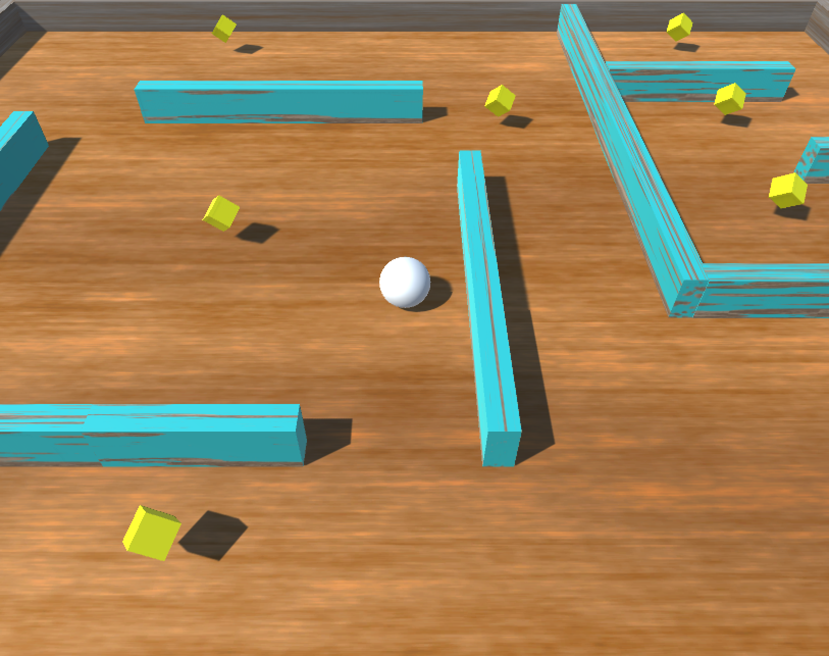
Roll-a-Ball is one of the first games you make in Intro to Game Development

Like any online course, you do have to have some self discipline in order to get through the material. With a $79 fee (per course) you can prove you completed all of the coursework. At the end you receive a certificate of completion that you can share on LinkedIn. Because I am someone that lacks self discipline, I decided to pay the fee. That way it acted as an extra motivator for me to complete the coursework. The certificates of completion also lend me a little more authority, which is useful.

If you’re interested in hearing more about a particular course, hit me up or drop a comment below. I might write some future posts about my favorite parts of the courses. If you are just interested in the technical side, skip Business of Game Development and Principles of Game Design. The Intro to Game Development Course by itself is enough to get you making relatively simple first person perspective games. But you can also take Advanced Game Development if you want to learn about how to make platformers.

Super Sparty Bros is a 2D platformer game you make in Advanced Game Development

Have you taken any of the courses I mentioned in this post? Finish the capstone? Think there are better courses to learn game programming online? I would love to see links to your projects in the comments, as well as your opinions about the specialization. Maybe you took another course and want to swap notes? Please share your thoughts below.

If you’re curious to see the projects I built in this class, here are the links below. They are in order from the first project to the last project. The last project, Queen Dungeon Escape, is probably the most fun since it actually has some unique mechanics.

Roller Madness – 3D Roll-A-Ball

Box Shooter – 3D FPS

Queen Dungeon Escape – 2D Platformer

If you enjoyed this article, consider following me on Twitter @nadyaprimak or if you need more tips on breaking into the tech industry, you can read my book “Foot in the Door”.

Is a Game Development Degree Worth it?

The other day I read a fantastic write-up by Australian game development professor Brendan Keogh titled “Are games art school? How to teach game development when there are no jobs”. Basically, it boils down to a discussion about whether or not a game development degree is worth it. It was actually a written version of his presentation from his talk at GDC this year, but since the video of the talk is only accessible with a subscription, he was kind enough to make a version that anyone can read.

It’s probably one of the best articles I have read about getting a game development education and what being a game developer really means. Brendan talks about how game students come in with a misconception about how the program is meant to prepare them to get a job in the AAA game industry. The problem with that, of course, is that there are waaaaay more game development students than there are jobs in the industry.

GDC, the official game developers conference in San Francisco where Brendan gave the talk originally

I have to agree with Brendan on this point, because even in the United States where we have the vast majority of studios, there are whole swaths of the country where game development jobs are almost nonexistent. That even includes metropolitan cities like DC, where the only major studio is Bethesda, but there are at least two graduate programs that I know of offered nearby, and a lot more in the surrounding states.

The thing is, I have a bit of personal experience with the graduate programs in the area. I actually enrolled in a class at one of them, and though I met many lovely people there, at the end of the day I just didn’t feel like the return on investment was worth it for the amount of money I spent. Of course I was in a unique situation, coming from a programming background, having also already made games on my own.

American University has a graduate program and game lab in Washington, DC, but few students end up in the AAA industry

That’s the part that is trickiest, which Brendan also brings up in his article. “The students I’ve seen have the most successes as game developers—be that finding any job or be that getting some form of recognition for the games they make—are the students who act like they’re already game developers. Because they are. You don’t need a degree to be game developer. I would tell this to students regularly.” That is what I feel like I knew intuitively, perhaps because my bachelors degree was in Visual Arts, and Brendan also spends a lot of time comparing game development studies to art school.

The reason he compares the two is because, like art school, students of these disciplines often end up having to pave their own way to a career. In fact, I found it quite interesting that he compared artists with game developers, because it ties into another post I wrote a little while ago about Nathalie Lawhead and her work which bridges the gap between art and games. The skills art and game students acquire can transfer to a number of different industries. For example, a game development student might end up working as a web developer, or a project manager, or a journalist.

Bethesda is the only AAA studio in the entire DC metropolitan area

Thing is, I already had to pave my way to a career after my bachelors degree. I decided I was going to be a web developer, so I spent two years working for my Alma mater in the art media lab while teaching myself JavaScript and building a portfolio. Having paved my way once, I am not as keen on paving my way a second time. Or at least, if I must pave my way, I would prefer to do it without sinking further into debt.

Ultimately, I decided it doesn’t make sense for me to pursue a graduate degree in game design and development. Reading Brendan’s article reinforced my decision. That is because it reminded me that if you make games, you are already a game developer. The degree will not make you more of one. That being said, I really liked how Brendan talked about his approach in teaching a game development program. If I lived in Australia, I might have considered taking his class.

Preview of some of Brendan Keogh’s games on itch.io

Getting students should be focused on making games early, and often. They should be looking at games that aren’t AAA quality but rather those made by indies all over the world. This shifts the perspective of what game development really is and what types of people make games. His article inspired me to stop being a perfectionist and focus on making simple things and releasing them. He also convinced me that the worth of a game development degree is (probably) not equal to the cost. That is, if you are not in great financial straits.

That is the true path to success in the game industry — start making games now. The more you make, the better you get. And the more chances you have of being recognized for what you do. Of course you will fail sometimes. Your game might even be a bit trashy, but that’s part of the process and how you grow. Oftentimes people wait until they are motivated to start a project. But, the sad truth is that if you wait for motivation it might never come. The truth is that action comes first, then motivation, which leads to more action. It is a cycle, but the first step is to make a game.

This blog post is both a reflection and response to the write up by Brendan. Still, I felt like I only touched the surface. If you are still want to learn more, I highly recommend reading it. He gets into all the nitty gritty details, with statistics and everything. You won’t regret it. Or check out his games on itch.io.

If you enjoyed this article, consider following me on Twitter @nadyaprimak or if you need more tips on breaking into the tech industry, you can read my book “Foot in the Door”.

How to Transfer an Art Style to Any Image

Machine learning and artificial intelligence have been on my radar for years now, but more as a concept and “thing I should know about.” I didn’t feel that I had the free time or skills to dig into it. However, my attitude about machine learning has changed in the past few months. I have seen new and easier tools become accessible to the public. In this post I will walk you through how to transfer an art style to any image using some of these tools.

One such tool is called Spell. Last week I spent days trying to set up Tensorflow on my laptop. The hardest part was getting the correct dependencies to run a style transfer algorithm. Transferring the style of an artist I admire to my photography seemed like one of the coolest things I could do, and I was determined. That determination wavered after traversing several levels of dependency hell. Eventually I realized that my machine could take days or weeks to train on a single artwork. That was when I decided to outsource. The tedium and frustration of dependency management as well as the expense/speed of the GPU was going to be handled by Spell.

An example of style transfer from Priyanka Mandikal’s blog

What’s great about Spell is it is absolutely free to sign up, and when you run commands they run remotely on Spell’s many CPU’s and GPU’s so you don’t have to keep your machine on for days at a time. They do charge you when you use their GPU’s, but the prices are very reasonable, and you are only charged for the time that the GPU was actually training your model (the one I paid for was $0.90 per hour, and training the model took 8 hours). They have good documentation and a very user friendly design, just to sweeten the deal.

Spell also had wonderful tutorials, one which actually included the Style Transfer training that I had been trying to execute. See it for yourself here.

The Scream by Edvard Munch

After some debate I decided to train my model on one of Edvard Munch‘s paintings (no, not The Scream, even though it’s a great one). Unfortunately, it didn’t turn out as cool as I hoped. I think this might be because I did not adjust he parameters for color or abstraction. Still, it was an exciting moment when I finally got the style transfer to work. I am even more excited to keep experimenting with it.

If you are interested in experimenting with AI and Machine Learning yourself, I highly recommend trying out Spell. Now you can show your friends how to transfer an art style to any image and play around with your own!

If you enjoyed this article, consider following me on Twitter @nadyaprimak or if you need more tips on breaking into the tech industry, you can read my book “Foot in the Door”.

Building a VR Game: My Top 5 Tips

About a year ago, I released my game Nightcrawler VR Bowling on Steam. It was shortly before Steam got rid of their Greenlight program, and VR games had the privilege of skipping the voting process because Steam was looking to get more VR games on their platform. Building a VR game won’t be easy, but with these tips you can have a smoother start and learn a little bit faster.

Putting a game on Steam was something that was on my bucket list, so by no means do I insist that step is necessary, but it does help to learn how the process works and what sorts of information game developers have access to. I do plan on releasing a more impressive game on Steam eventually, but for the immediate future I’m making Nightcrawler VR Bowling free, so anybody can try it out if they want to.

I learned a lot from making this game, and wanted to share some of the pitfalls and strategies and helped me make Nightcrawler VR Bowling a reality.

A screenshot from “Box Shooter” the game which I converted to VR

Take a simple 3D game and convert it to VR before starting.

In my case, I took a game I made in a class on Coursera called “Box Shooter” (the link will take you to the game) where you are placed in an arena full of multicolored moving blocks and you shoot different colored boxes for points. By converting it to VR instead of starting on a game from scratch, I was able to think about the specific VR challenges in terms of user interface and input separately from all of the other game design challenges that were independent from VR. It also gave me a quick win that helped fuel my drive to keep going.

A screenshot from one of the input utility example games

Use a game engine that already has VR kits and input utilities, and test them out

This one may seem obvious, but especially if you haven’t made any other games previously you may not know about these tools. Unity has a TON of great VR kits and input utilities to get you started, which include examples for you to play around with. Make sure you open those examples in your VR headset and try them out before getting started on your game.

Beat Saber, a very popular game, actually has relatively simple interactions… just hit the squared with your sword

Keep your controls and interactions simple.

Your first VR game is not going to blow anyone’s mind (unless they’ve never put a VR headset on before). The best way to gain experience and not to give up halfway is to make a simulator game. In my case, I decided to simulate a game of bowling. It’s easy to get super excited about VR and come up with a pie-in-the-sky idea but you will almost certainly either become too intimidated and give up altogether or end up settling for something that you’re not at all satisfied with. If a simulator seems boring, try to think of how you might put a twist on it. In my case, I created a surreal environment for the bowling experience. You will be much happier with yourself and your game if you actually attain the goals you set.

Yes, you will probably look like an idiot while playtesting. No, that should not faze you.

Get comfortable inside the VR environment

You will be playtesting your game a lot. If you’re not sick of playtesting by the time your game is finished you’re doing something wrong. There is no such thing as too much playtesting. That being said, you should get comfortable inside the VR environment before you start playtesting, because some things will feel unnatural at first just by virtue of being in VR. It also helps to get other people that have played in VR to play your game, but obviously you cannot ask your friends to play your game hundreds of times. Yes, you will probably end up playing your own game hundreds of times. After all, every time you make a change, you gotta put that headset on and check and make sure the game is working like it’s supposed to. Make sure your headset fits or you will have one hell of a headache by the time you’re done!

VR simulator games like “Job Simulator” are a lot of fun and great to take inspiration from.

Take inspiration from what’s out there

This tip should be taken with the “keep it simple, stupid” principle in mind. You might be inspired by VR games which were made by a team of professionals. That is cool, but you are not going to make that game (if you do, please message me and I will send you cookies). There are tons of awesome VR simulator games and other games that might sound simple or even boring but are actually tons of fun to play. Taking a look at other games will also help you see what is (and isn’t) possible.

Okay, that’s all the tips I’ve got for now! Another thing you can try is joining a game jam, something I write about in this post here. Think I left anything out?

If you enjoyed this article, consider following me on Twitter @nadyaprimak or if you need more tips on breaking into the tech industry, you can read my book “Foot in the Door”.

Net Art Resources | Why I Miss the Early Internet

Following up from my article “Why I Miss the Nineties Internet” here are some useful resources if you’re interested in getting involved with creative coding in the net art space or want to take a look at some old school websites for yourself.

https://archive.org/web/

The Wayback Machine allows you to search URL’s from the past and see screenshots of old websites. It’s an impressive archive.

http://oldweb.today

Similiar to the Wayback Machine but appears to retain some interactivity as opposed to simply a screenshot of an old webpage. Actually simulates the browser window.

https://www.webdesignmuseum.org

Web Design Museum has screenshots of many of the early versions of major corporate sites like Paypal, Netflix, and Apple.. but it also has tons of lesser known websites that really show the range of design experimentation that was happening in the 90’s and early 2000’s. It’s a great source of inspiration for artists who want to draw on that sense of old internet nostalgia.

http://rhizome.org/program/

Rhizome is a hub for digital artists who work with the web. It was founded by Mark Tribe when artists were just beginning to experiment online and has an impressive archive. There are tons of creative coders featured on this website who combine art and technology in unique and fascinating ways.

http://networkcultures.org/blog/publication/no-12-variant-analyses-interrogations-of-new-media-art-and-culture-patrick-lichty/

I had the pleasure of meeting Patrick Lichty in person when I was in college. Lichty has been practicing with digital media long before I was born and wrote these insightful essays on how digital art has evolved from the very early days.

http://www.teleportacia.org/war/

A classic piece of net art “My Boyfriend Came Back From The War” was made back in 1996 by Russian artist Olia Lilinia.

https://ristar.itch.io/secret-little-haven

Made by Victoria Dominowski, this is another game that draws on nineties internet nostalgia, but focused more on the AOL chatroom aesthetic. Even the name “safe little haven” reminds me of how I felt about my computer back then.

I hope you find these net art resources useful! Are you inspired to make an experimental game? What do you think of the internet of the nineties? Do you have a favorite artwork or game among those which I shared? Any ideas of your own about how to improve the internet and make it a better place? Please share your thoughts in the comments below.

If you enjoyed this article, consider following me on Twitter @nadyaprimak or if you need more tips on breaking into the tech industry, you can read my book “Foot in the Door”.

Why I Miss the Early Internet: Part 2

This is a continuation of “Why I Miss the Early Internet: Part 1”.

What can we do to revive the experimental attitude that prevailed in the nineties internet? We can do is form our own community of web experimenters who draw upon the nineties internet for inspiration. There are artists today who leverage our nostalgia for the nineties internet and create experimental games and other media which bring back that sense of wonder and mystery that used to be all over the internet. Artists who capture magical moments where you stumble upon something that resonates with you completely unexpectedly, like an explorer in the wilderness. My personal favorite artist who makes work like this is Nathalie Lawhead.

You can find most of her work, which has been described both as art and as experimental games, at her itch.io page. Much of Nathalie’s work draws on the psychedelic, strange, and surprising aspects of the early internet. Her color palette is bright and minimalist, her characters cartoonish and bizarre. In some of her work, like “Everything is going to be OK,” Nathalie evokes the feeling of an nineties desktop computer display, with the low resolution application icons and abstract background.

A screenshot from Nathalie Lawhead’s game “Everything is going to be OK”

As you click on each application you are presented with little vignettes that are very personal to Nathalie’s life. The nineties internet aesthetic fits the subject matter perfectly, because it is fragmented, sometimes difficult to understand, and demands the full attention of the user. It is both mysterious and fascinating, and rewards users who take the time to explore the interface for hidden secrets, taking on the explorer mentality I mentioned earlier.

I don’t want to describe Nathalie’s work in too much detail because she does it better herself than I ever could, and she has plenty of content describing her work, both on her blog and on youtube. If you have any interest at all in making experimental games or interactive experiences, I highly recommend checking out her stuff.

Another screenshot from “Everything is going to be OK”

Hopefully by now it makes sense why learning about the early internet is not just for historians and nerds. Artists like Nathalie and others draw upon the nostalgia and use it to create fantastic experiences that are both unique and compelling. I hope this article motivates people to explore more digital content that draws upon old internet tropes.

If you’re interested in creating your own net art or experimental games and looking for some additional resources, check out my follow up article.

If you enjoyed this article, consider following me on Twitter @nadyaprimak or if you need more tips on breaking into the tech industry, you can read my book “Foot in the Door”.

Why I Miss the Early Internet: Part 1

I was born in 1991 so I feel like I got the tail-end of the wondrous, strange, and experimental world of the early internet. Yet even though I was a kid and even though the internet is a lot more accessible now than it used to be, I still long for the days of the nineties internet. It really felt like the wild wild west back then, with each new website I encountered like finding a unicorn while out on a stroll. I think even the inaccessibility made it feel like a more magical place. Let me explain why.

It wasn’t so simple as just turning on your computer and clicking on your browser icon. Maybe it was also because I was just a kid, but I imagined that awful dial-up tone as the sound of the data traveling thousands of miles and connecting to other computers in far-away places.

The most popular browser of the nineties was not the most glamorous

I visualized how the data would travel into the telephone and across all the poles I would see outside when my parents drove me to school, like a squirrel racing across the wires. At the time I really believed it to be a kind of magic, that if I broke apart the computer I would uncover some kind of little fairy behind the screen.

In some ways today’s internet is better, of course. The field of user experience did not even exist in the nineties, and there were no standards defining what made a site easy to use. Even worse, there were no screen reader tools or really any tools that allowed people with disabilities to use the internet.

A homepage for a game developer from 1996

Yet I think something was lost with the new era of user research and user experience, along with all of the CSS frameworks like Bootstrap which homogenized the web design landscape. These days most websites look very similiar, and people are afraid of straying from the popular styles. I think this is a bit tragic, because there is a lot less experimentation, almost like people have given up creating anything new on the web.

For artists I think the modern internet is especially challenging. Everyone is scrambling to share their work on Instagram, Twitter, Facebook, and that’s only the popular social websites. When you start factoring in blogs and portfolio sites and other creative communities the numbers become staggering. Creative types just getting started in their career have a hard time getting noticed unless they carve out a very specific niche for themselves. The problem with niches, just like the problem with the current homogenized web design of the modern web, is that it also takes away room for experimentation.

Geocities was a popular platform in the time period, with lots of moving images, background music, and general psychedelic vibes.

Sometimes I like to ask myself theoretical questions about where the internet might be today if things had gone differently. What would happen if Google was only one of several popular search engines? What if the internet had gone a totally different direction, or remained the domain of early adopters and academics rather than becoming a mainstream commodity? What would an internet that was not dominated by corporate entities look like? What would an internet made for digital artists look like?

While technically from 2001 and almost impossible to read, this website illustrates just how experimental people used to be on the web.

Of course, all of this might seem terribly pointless to ponder. Sure, you might be thinking again, it’s interesting to consider these questions, but what can we do with this information now? We cannot turn back the clock on all of the UX research nor can we persuade corporations to stop offering their services online. Most of us rightly wouldn’t want that to happen even if it was an option, because accessibility for disabled folks and shopping online are things that we appreciate.

This is Part 1 of a two part blog series. Check out Part 2 here where I talk about artist Nathalie Lawhead and how she leverages the nineties internet aesthetic today.

If you enjoyed this article, consider following me on Twitter @nadyaprimak or if you need more tips on breaking into the tech industry, you can read my book “Foot in the Door”.

Creative Coding Resources | When Artists Write Code

This is a follow up to my article reviewing the exhibit at Artechouse DC.

If you’re interested in popular creative coding tools like Processing I suspect the artists behind the Artechouse DC exhibit used, you should absolutely check out some of the links below.

While I certainly can’t guarantee that learning Processing will ever get you selected to exhibit at Artechouse, you will come away with a better understanding of how some of these art exhibits are formed. There’s also tools like Arduino which I am sure were involved at some point.

https://processing.org/

The main Processing website. Lots of examples, documentation, and tutorials for getting started with Processing, even if you’re new to code. Processing uses a very simple language based on Python that is quite easy to learn. There are also examples that allow artists to experiment with to start creating generative art quite quickly.

https://www.openprocessing.org/

A community for Processing developers, where its super easy to share your work and create a portfolio. If you’re looking for inspiration or source code to experiment with to see what sort of changes happen, this is a good place to go.

http://learningprocessing.com/examples/

Tons of examples of Processing in action, with code snippets alongside the result. All the exercises and examples are accessible online for free, with the code displayed alongside. There are also comments in the examples explaining parts of the code. It’s easy enough to copy and paste it into your IDE and make changes if you want to experiment more.

https://openframeworks.cc/

Open Frameworks is a open sourced, C++ based toolkit for creative coding. As they say in the about section, “Our intended audience are folks using computers for creative, artistic expression, and who would like low level access to the data inside of media in order manipulate, analyze or explore.” Might be a little harder to get started if you don’t have any coding background, however.

https://www.sergioalbiac.com/

One of my personal favorite Processing artists, who also experiments with artificial intelligence and machine learning to create amazing images. Although he sometimes uses Processing experiments to inspire his paintings versus the other way around, I find looking at his work always inspires me.

https://www.arduino.cc/en/Main/Products

Arduino boards are often used in tandem with Processing, because they allow for users to actually interact with the art. They are like miniature computers that can be setup with whatever inputs and outputs your project needs.

Did you find any of the above links helpful? Did you think the cherry blossom exhibit was better? Are you already exhibiting in spaces like Artechouse, or hope to in the future? I’d love to hear from you about your own experiences with tools like Processing and Arduino, and what you think of where the world of creative expression with technology is going. Leave your comments below!

Can Artists Write Code? Artechouse DC Review

My first visit to Artechouse was early this year, around January or February. I’ve visited a second time since then but I want to talk about the first time I visited, because the exhibit was more down my alley and also because I think first impressions tend to be the most vivid.

It’s an incredible space, entirely underground except for the small reception area where people must put on the goofy slippers and pay the fee before they can descend into the dark depths of the gallery. It’s at least two or three flights of stairs down before the space opens up and you are greeted with a big door and a screen that offers an overview of all the exhibits.

A lot of emotions come up for me when I visit spaces like Artechouse. It’s hard not to feel a little bit of envy for all of the artists that “made it,” because few artists who use computers as their primary medium get to exhibit to a wider audience. Galleries are still thought of as primarily spaces for artists who work with paint and clay and pencil than those who wield projectors and styluses and arduinos. Not to mention the DC area isn’t known to be a big hub for contemporary artists.

The envy started to fade once I actually saw the main exhibit, though. Once the big doors opened wide and I walked in with my husband and saw the expansive room with its giant walls all being projected on simultaneously with entrancing patterns, it was hard not to stare. I have to admit, I was quite mesmerized. The work reminded me of some of my experimental art from college that I made with Processing. It’s a programming language that was made more accessible to artists, and designed to manipulate pixels for visual effect.

Afterward I read the details for the exhibitions but it wasn’t written anywhere what specific software they used. I wasn’t terribly surprised that the artists kept it a mystery. Or maybe they just thought nobody would be interested in reading about it. After a little while of standing, I laid down in one of the bean bag chairs arranged on the floor and enjoyed the changing visuals for quite some time. There was something reminiscent of space and faraway galaxies in the projections on the walls. They were larger than life and constantly changing but in an unhurried, natural sort of way. Even the music reminded me of the soundtrack from space films like Interstellar or Solaris. Being in that room felt like being part of the grand mystery of life and the solar system.

Eventually we moved to the left side corridor, where there was more art awaiting us. There was a series of human-size screens arranged in a row, and people were standing in front of some of them changing their poses and watching the screens intently. I realized pretty quickly that the image on the screen would respond to you, probably via a hidden camera somewhere in the room. The image that looked back at you was kind of like a silhouette, but a bit more amorphous. My guess is that Processing was used for this exhibit too, because I have also experimented with some of the effects that Processing has when connected to a webcam. Although the work was intriguing, I wasn’t as excited by it as I was by the first piece. Yet there was a certain alien quality to the way the images responded to you, like a mirror into another world.

Farther down the corridor opened up into a larger room again, not quite as big as the first but still larger than a living room. Looking back now I think this exhibit was the most stimulating, at least from an intellectual perspective. There were about six vertically oriented screens set up in a circle, and people were invited to stand inside the circle. The screens were receiving live data regarding trending topics on twitter. In relatively short cycles the screens would alternate from displaying tweets to display a visual rendering of different emotions in the tweets. Sometimes there would be a spike of emotion, for example anger, and an outpouring of red shapes would shower the screen. The last stage was the most beautiful, when all of the different emotions displayed at once to create a kaleidoscope of shifting colors.

While this was fascinating to look at what I found even more fascinating was the screens off to one side, where you could dissect the data being fed into the artwork in more detail. There was something about seeing it all in front of you in real time, and seeing the aggregation of that data, which really helped to get a better grasp on the sheer amount of human interaction and expression occurring at every moment. It is truly mind boggling. I stayed in that room a long time, fascinated by the changing emotions and colors in the exhibit. There was something about how all of that data, all of those voices at once created something that was both greater and separated from each individual. Almost like it gained a power and force of its own.

The final exhibit at Artechouse was on the opposite side of the main room, and unfortunately the least interesting from my perspective. The screens were positioned above you so that you had to lay down on a cushion in order to experience the artwork fully. Laying down did give me a different perspective, sort of like how I imagine one might feel inside a spaceship when down becomes up and up becomes down. The smaller room also made the space feel more intimate, and even a little bit claustrophobic. My husband described it better than I could. “It was like going through hyperspace in Star Wars except the hyperdrive was broken so it kept shorting out, gave me an eerie feeling of being lost in space on a broken-down ship.”

Overall, I think I will be going back to Artechouse many times in the future. I wish there were more exhibits in DC that combined art and technology. Artechouse has two other locations, in NYC and Miami, though I expect those locations also see more competition in the space of art + technology exhibits. I’m curious to hear from anyone reading this that might have been to those locations. What were the spaces like? Did you come away impressed or disappointed?

Like I mentioned earlier, the second exhibit I saw at Artechouse did not impress me as much as the first. It was a cherry blossom themed show, with all women artists. I absolutely appreciated the decision to feature women artists but the exhibits were not as interactive or multifaceted as those I described in this post. If you want to read more about that exhibit and see some images, check out this article.

If you’re interested in Processing or any of the other tools that I suspect the artists behind these exhibits used, you should absolutely check out my follow up post citing some great learning resources.