I am a perpetual learner, who is fascinated with the ever evolving web. As a result, my professional focus thus far has been web development, in particular developing interactive user interfaces with javascript and popular libraries such as Angular.
My other passion, which naturally overlaps with web, is game development, which I am nurturing in my free time and through a Game Design Certification through Coursera. It doesn't hurt that I used game development to teach myself much of the Javascript that I know. Most recently I have become fascinated with VR and its applications for mental health and increasing empathy in our society by putting us in someone else's shoes.
When I'm not hunched over my computer making games or coding websites, you can find me slouched in front of my TV playing games or watching shows. Well, I guess I also like hiking, photography, and cats. All the cats.
Feel free to email me about projects, freelance opportunities, provide feedback, or just say hi! I love meeting new people in the industry.
[email protected]
Download Resume
Working in collaboration with the UX Designer and web developer for NIAMS website at large, I developed and partiall designed the user interface for the NIAMS catalog. The reason I say partially is because the footer and banner were already designed and reused across all of the websites under the NIAMS umbrella. However, there were unique problems to be solved around the catalog specifically, and quite a few constraints as well. For instance, the code was written in Coldfusion, which forced me to make many of the visual changes to the UI with SASS. I also reused some of the common components that all of the NIAMS sites used, including the color scheme and design for buttons, spacing, and font. It was important for users to recognize the site as part of the NIAMS brand while also being able to easily access any catalog item they wished.
Some additional design challenges included offering flexibility for other languges, especially Spanish which all of the NIAMS catalog pages supported. Also making the site responsive was especially challenging because there were many tables used throughout the design that were limited in terms of maintaining clarity as they were resized. These were all challenges that I tackled, therefore acting as both developed and designer for the NIAMS catalog. Screenshots can be viewed below.

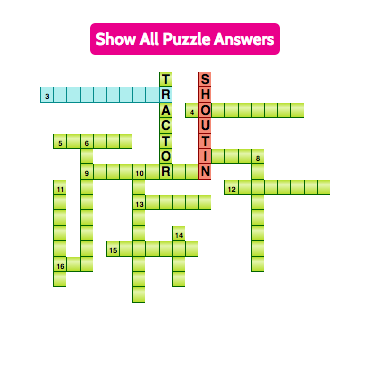
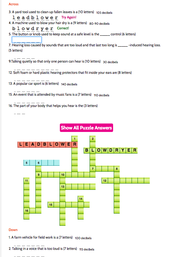
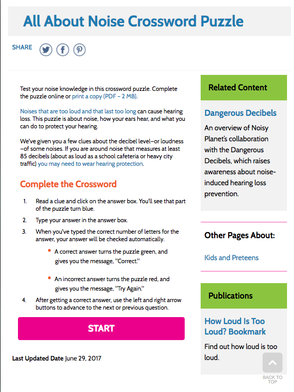
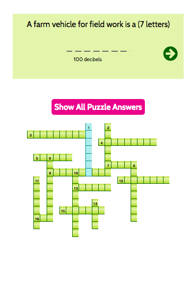
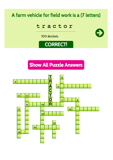
Noisy Planet falls under the NIDCD (National Institute on Deafness and Other Communication Disorders) department, but is a website specifically geared toward children. The crossword is meant to help children learn the vocabulary related to noise and hearing. Prior to the redesign, the game was written in Flash and was not responsive. It could only be played on a computer, which was quite limiting given how many kids prefer to use their tablets or smartphones to play games. I was tasked with not only redesigning the crossword but also developing it to be both easy to play and easy to read on different screen sizes.
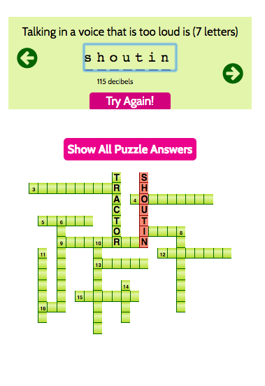
I programmed the crossword with jQuery to make it easier to traverse the DOM, which had to happen every time the user entered a new letter. This created the optimal user experience of seeing the crossword get populated as you typed, providing immediate user feedback. I also used a mobile first approach, because I knew that tackling the mobile experience for the crossword would be more difficult than the desktop. Not wanting to re-create the wheel, I searched the internet to see what other crosswords I could find and see if they would inspire me. I ended up looking to the New York Times crossword. Though I felt that their interface was unnecessarily complicated, I took a cue from the NYT design by only letting the user see one crossword question at a time. Unlike the NYT interface, the only menu involved was two arrows for going back one question or forward to the next question. The crossword would also conveniently highlight which question you were currently on, so as not to confuse the user about whether they were looking at an up-down or a left-right part of the crossword.

I was contracted by Anheuser-Busch to work on a rapid mobile app prototype with a team of developers. My contribution was primarily UX/UI mockups and programming design tweaks in Xcode. I created the launch image, icons, and overall look and feel of the app. Having no knowledge of Xcode prior to this project, I had to learn on the fly.

The goal of the prototype was to be functional enough to pass on to Anheuser-Busch's internal team of developers. The primary goal of the app was to keep track of liquor licensed bars and restaurants interested in the new Stella Nova Draught countertop bar solution, for marketing purposes. Content is blurred for disclosure policy reasons.

One of the biggest challenges of the project was not just learning the Xcode interface, but learning the Swift coding language in order to manipulate elements of the app that were difficult to change with the visual drag and drop editor.
Factba.se was an ambitious project combining AI transcription technology, web scraping, and data visualization to create a search engine that would allow customers to dig deep into data around any specific politician, and see detailed emotional and contextual analysis for every word that politician has ever said.
Factba.se was designed with a customer in mind that might want to create dozens or even hundreds of Factba.se's for different politicians. Factba.se itself would be the final search engine UI that users would see after providing a politicians social media accounts as well as uploading any additional content such as videos the customer might have recorded themselves as a rally or meeting. This secondary platform was the Factaba.se Generator.
I was tasked with creating the user interface for the search engine, with filters, additional results upon scrolling, the ability to discover new content (inspired from Wikipedia), and easy ways to visualize the overwhelming amount of data that was gathered. Below are screenshots from the final customer-facing design.
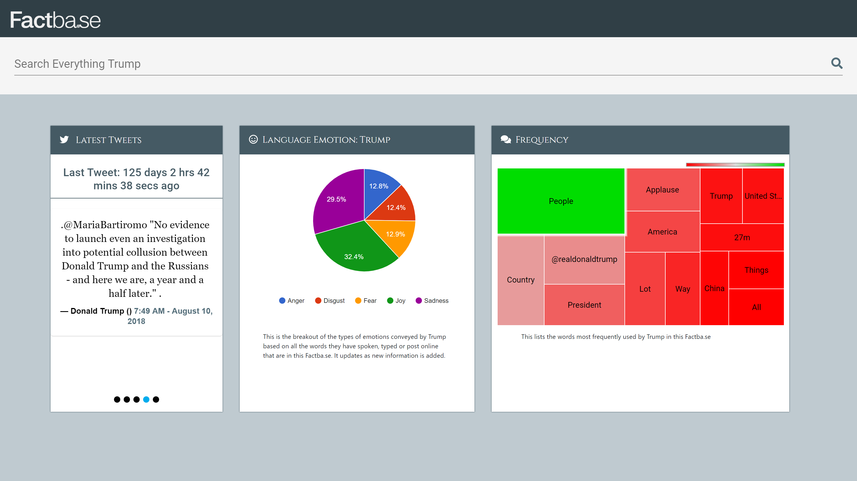
The Factba.se home page included three widgets, one with the last few Tweets that politician had written, the overall emotional breakdown of everything included in the database (to give an idea of general emotional expression), and finally the words that the politcian uses most often in a tree graph format.
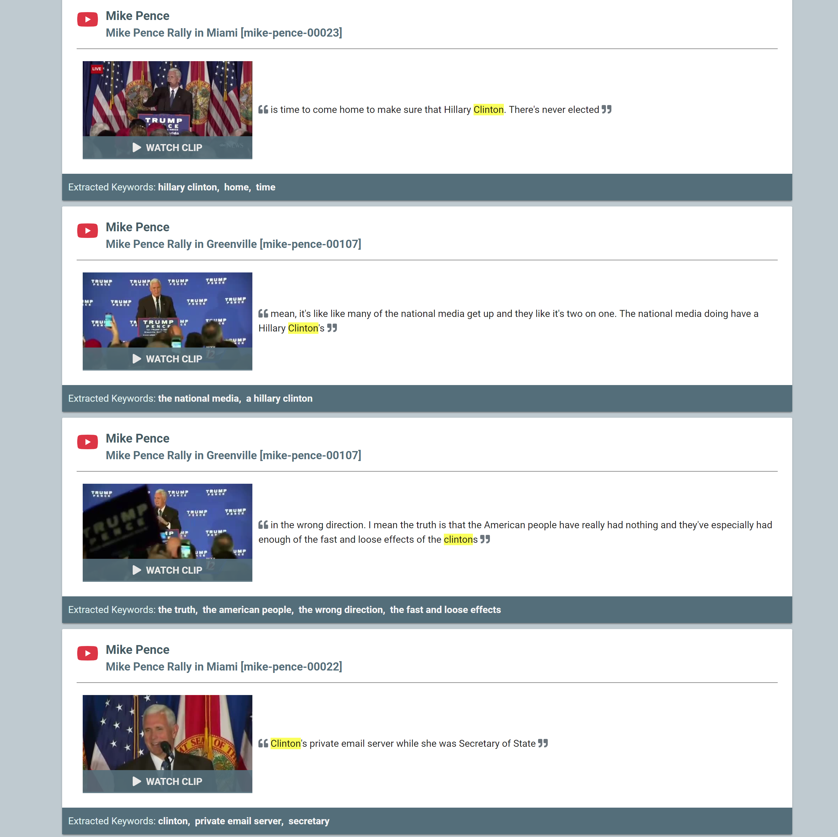
Once a user runs a search, results appear in the format displayed above. Most results are videos, though if Twitter or text results were available, the icons would correspond and Text results would link to the transcript rather than a clip view, and would not have an image thumbnail. Note that the word searched is highlighted in each result.
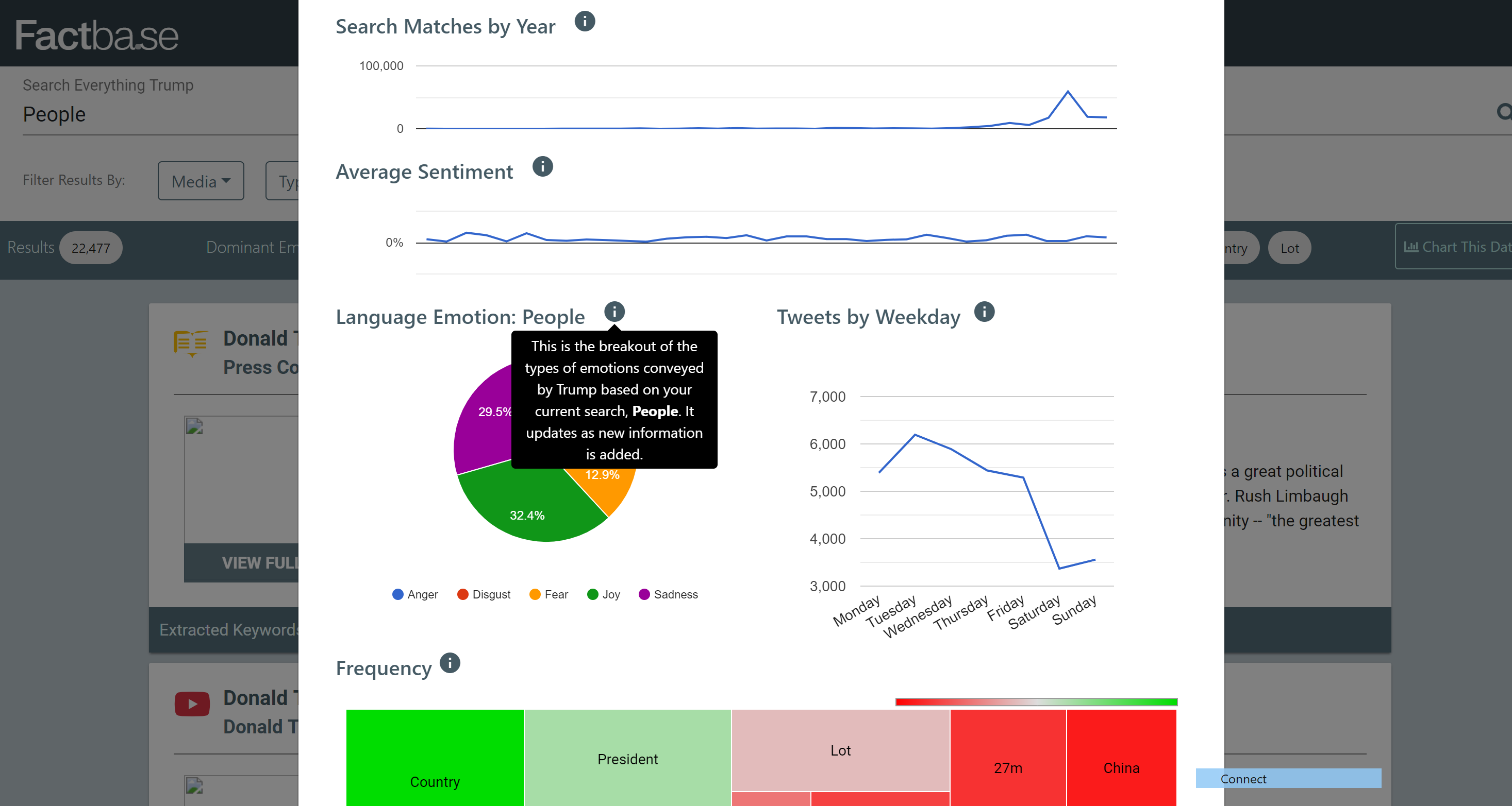
When running a search on a specific word, there is a button right underneath the search bar called "Chart Data" which will create visualizations (seen above) around all of the currently filtered results. This allows customers to see, for example, what days of the week the politician tweets about that particular topic. They can also see how often the topic in search over the years, or what other words the politician uses the most when talking about that topic.
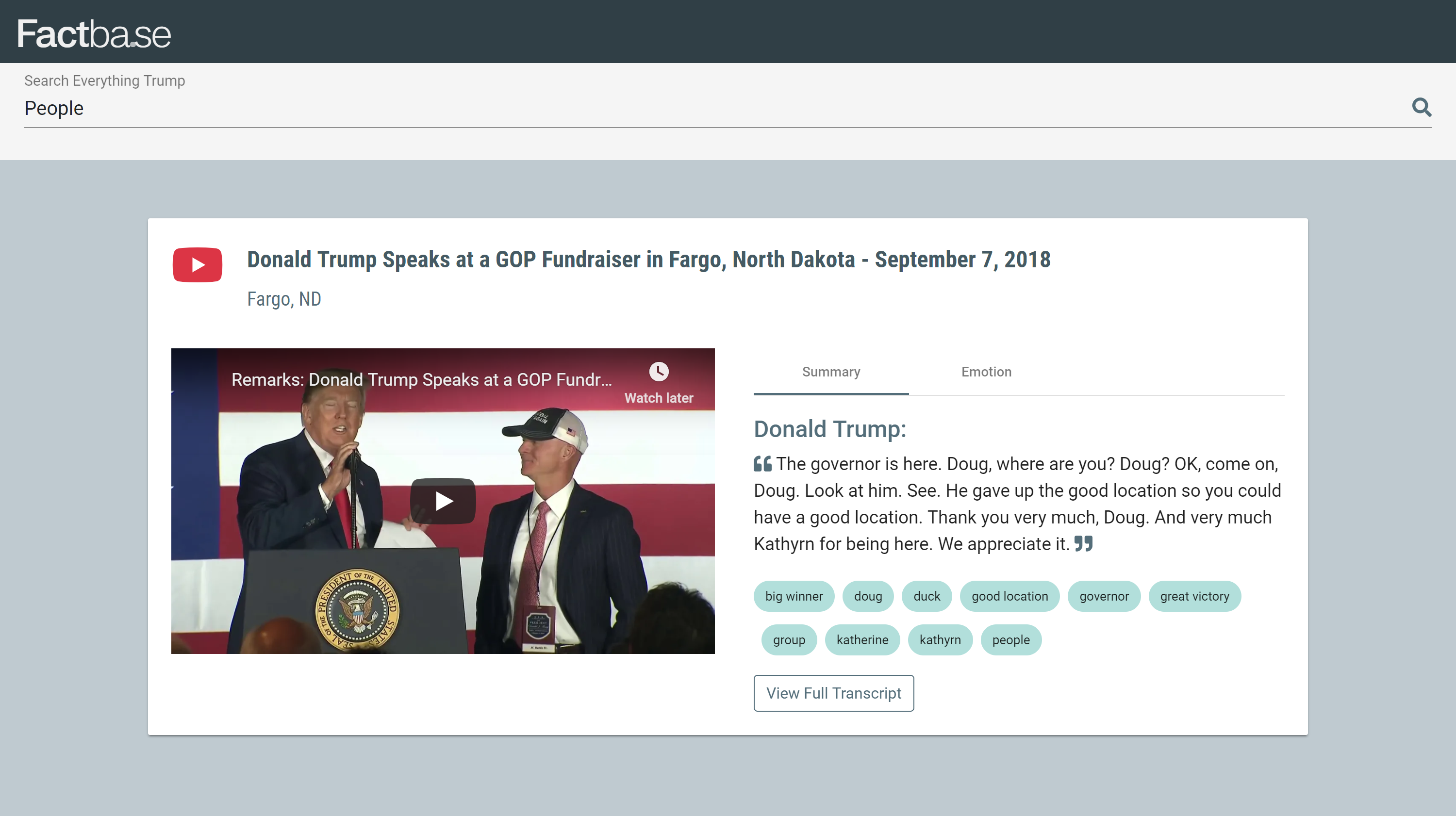
When someone clicks on "Watch Clip" they will see the text on the right hand side from the snippet that included the word they were searching for, as well as the full video on the left hand side (however, when clicked, the video will jump to the timecode where the politician is saying the specific words in the snippet). Notice that the search bar remains, for users to see context of what they had been searching for, and to easily return back to search.
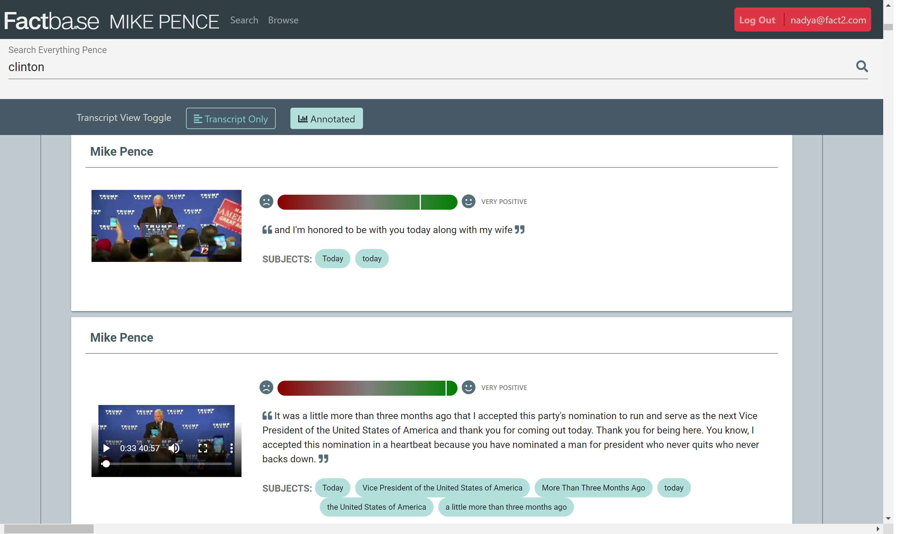
At the time that "View Transcript" is clicked, the user will be able to view the transcript in two modes, "Annotated" which provides sentiment analysis for each chunk of text (usually divided in sentences or when the speaker takes a breather) as well as tags to identify the subject matter.
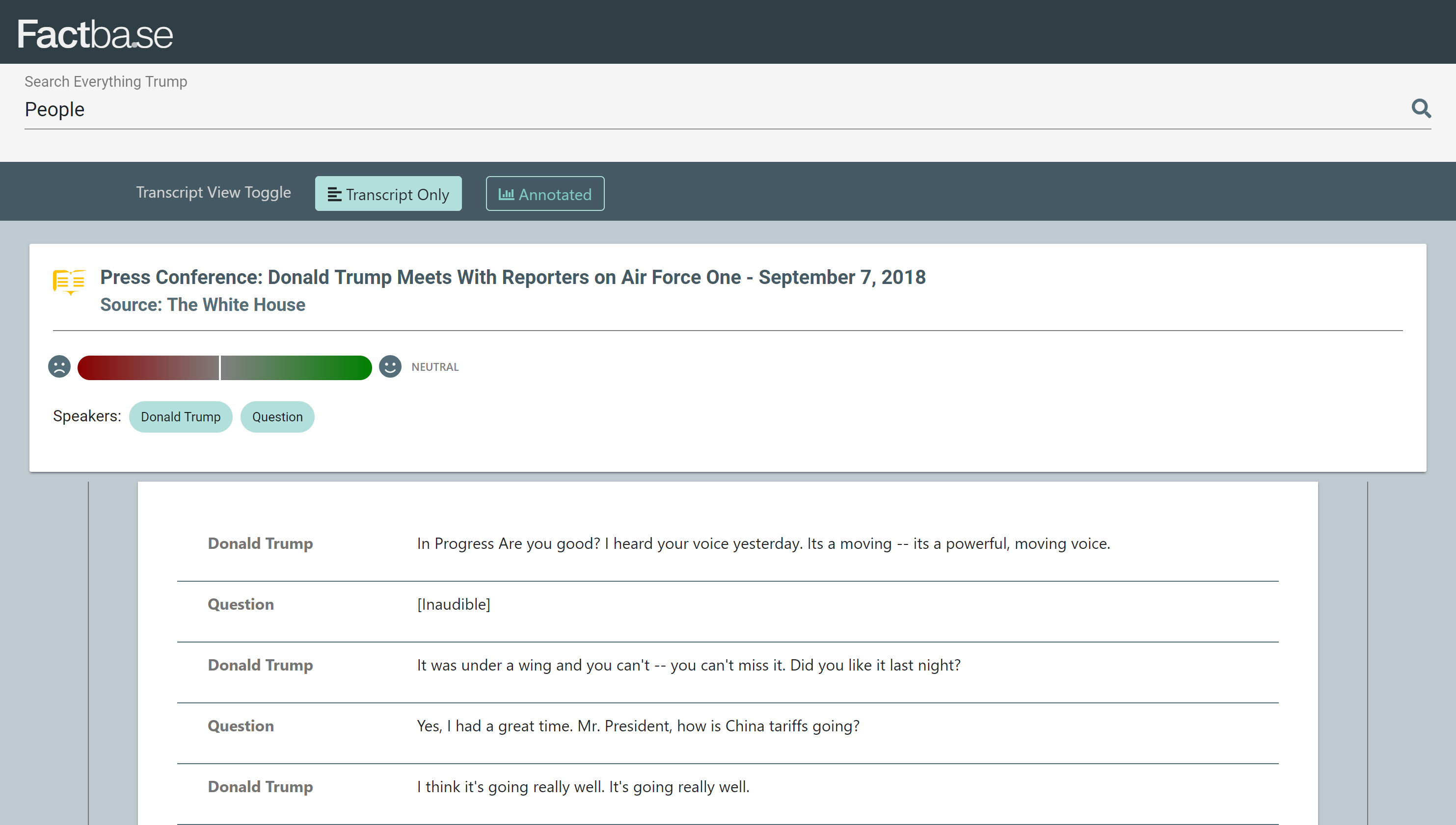
In "Transcript Only" mode, users can easily read the transcript without unnecessary scrolling, but still see the most pertinent information and summary of the transcript at the top.
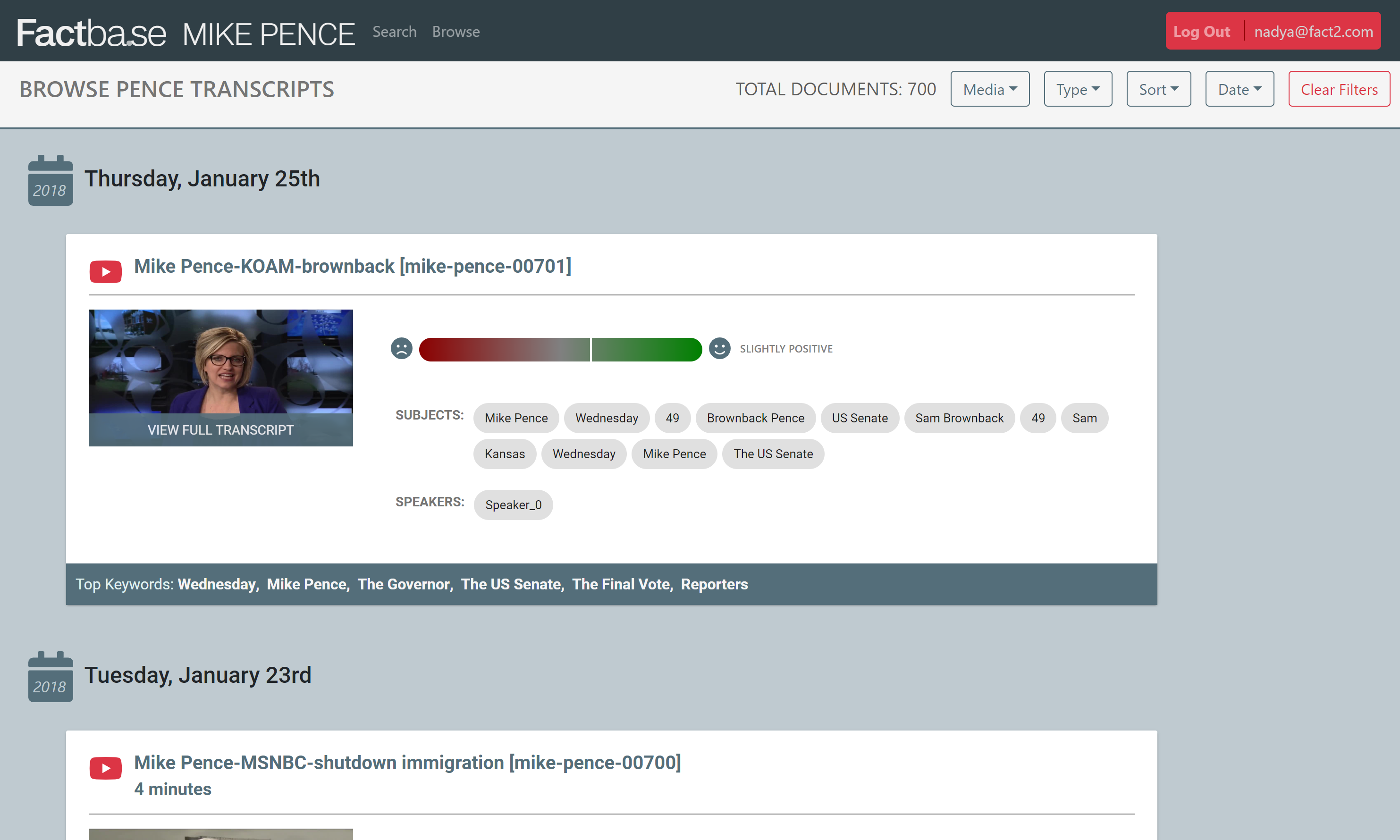
In addition to search mode, browse mode was created for easy browsing of content when users aren't looking for a specific context but just want to see all of the data they have on a politician. Filters remain for date, type of media (video, text, audio), and where the data was gathered from (interview, position paper, vlog, etc).
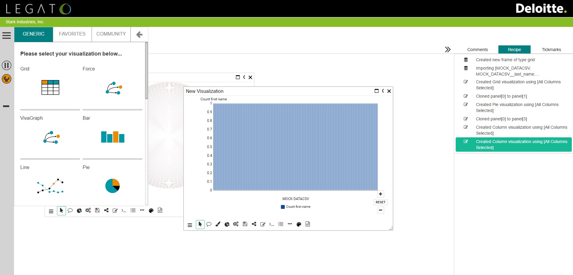
I was hired through Nolij Consulting to work on customizing an open source data visualization application built with Angular for a client catering to auditors. Semoss is an extremely robust data visualization engine where any kind of data can be plugged in and turned in dozens of different visualization types.
Besides reskinning Semoss for the client, the auditors wanted to have their data all in once place, rather than having different data sets for each visualization. This required significant refactoring, because it also meant each visual would be cloned from the master. Some of the other capabilities of Semoss include keeping track of each process the user executes, having multiple sheets per workspace and multiple visualizations per sheets. Not to mention the large number of widget handles, which allow users to do all sorts of tasks such as adding comments to their visualization, change the colors, save, and publish.

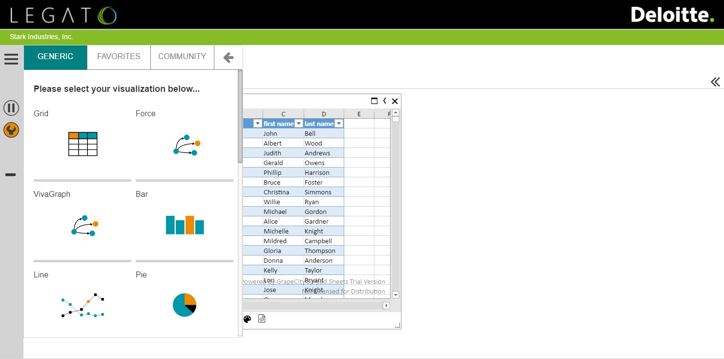
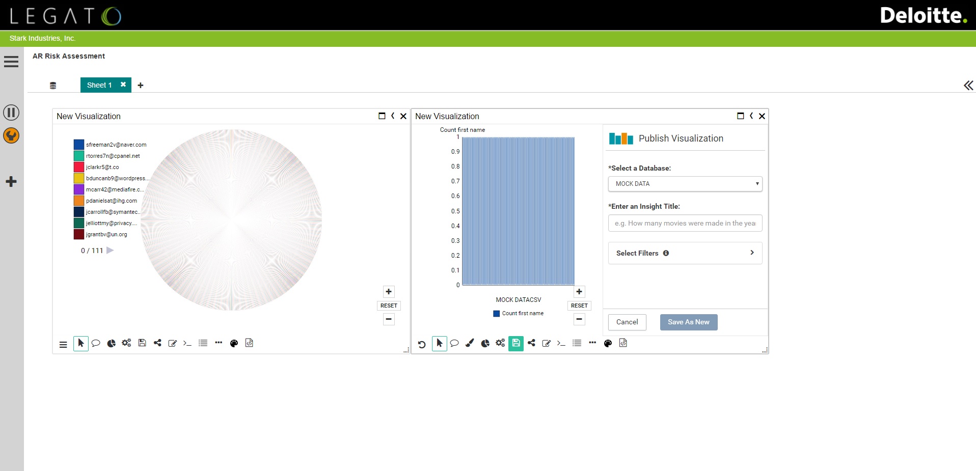

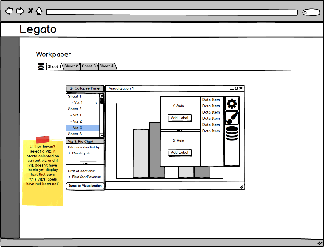
I had a lot of say in how the user interface was implemented, and was responsible for making a number of mockups and presenting them to the client. I used Balsamiq to create drafts of how the Master Dataset might look, how the user could potentially choose to clone their visuals, and more. With so much going on in the page, it was important to try to make the interface as simple and unobtrusive as possible. You can see some of these mockups below.


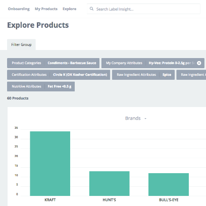
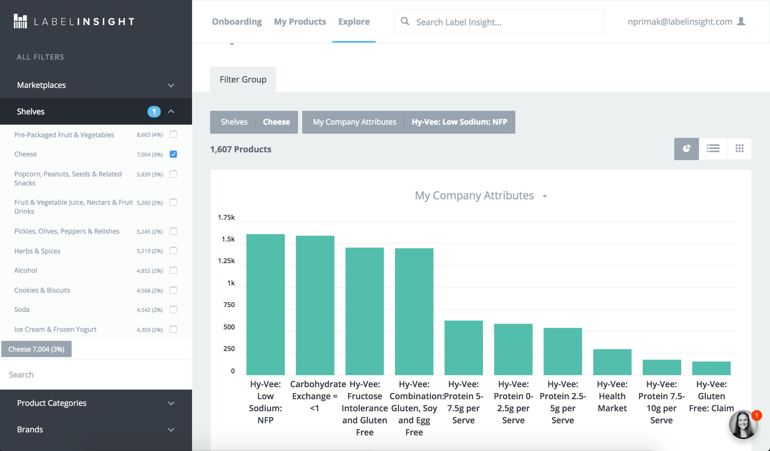
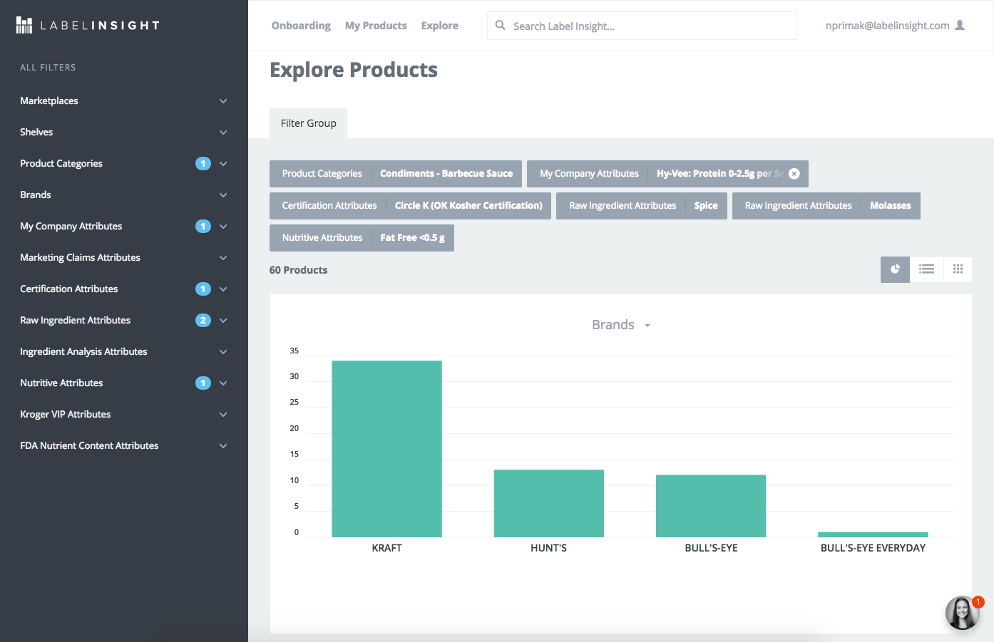
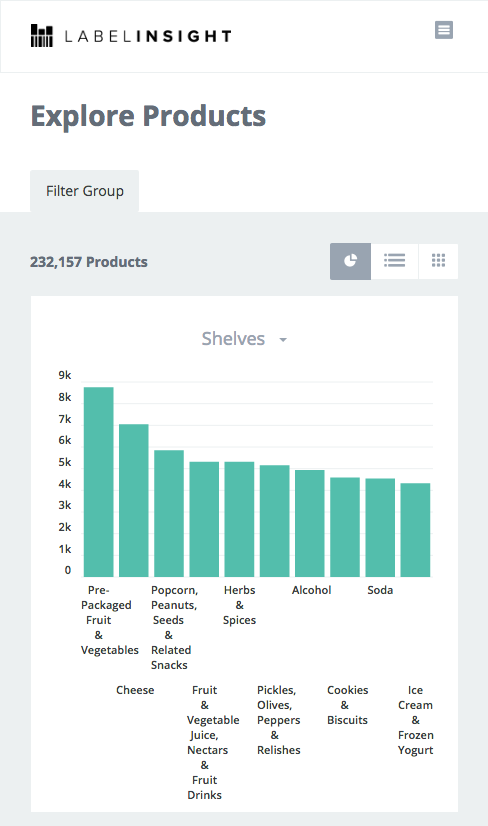
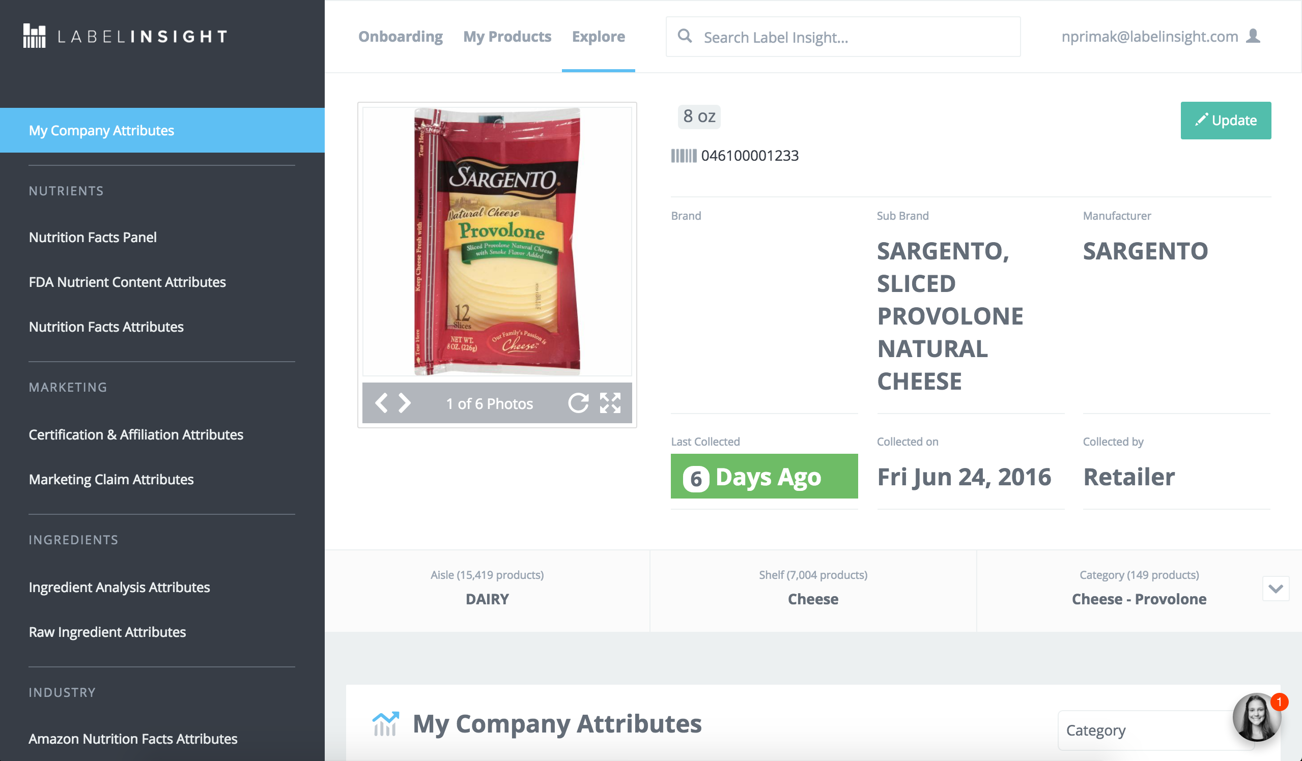
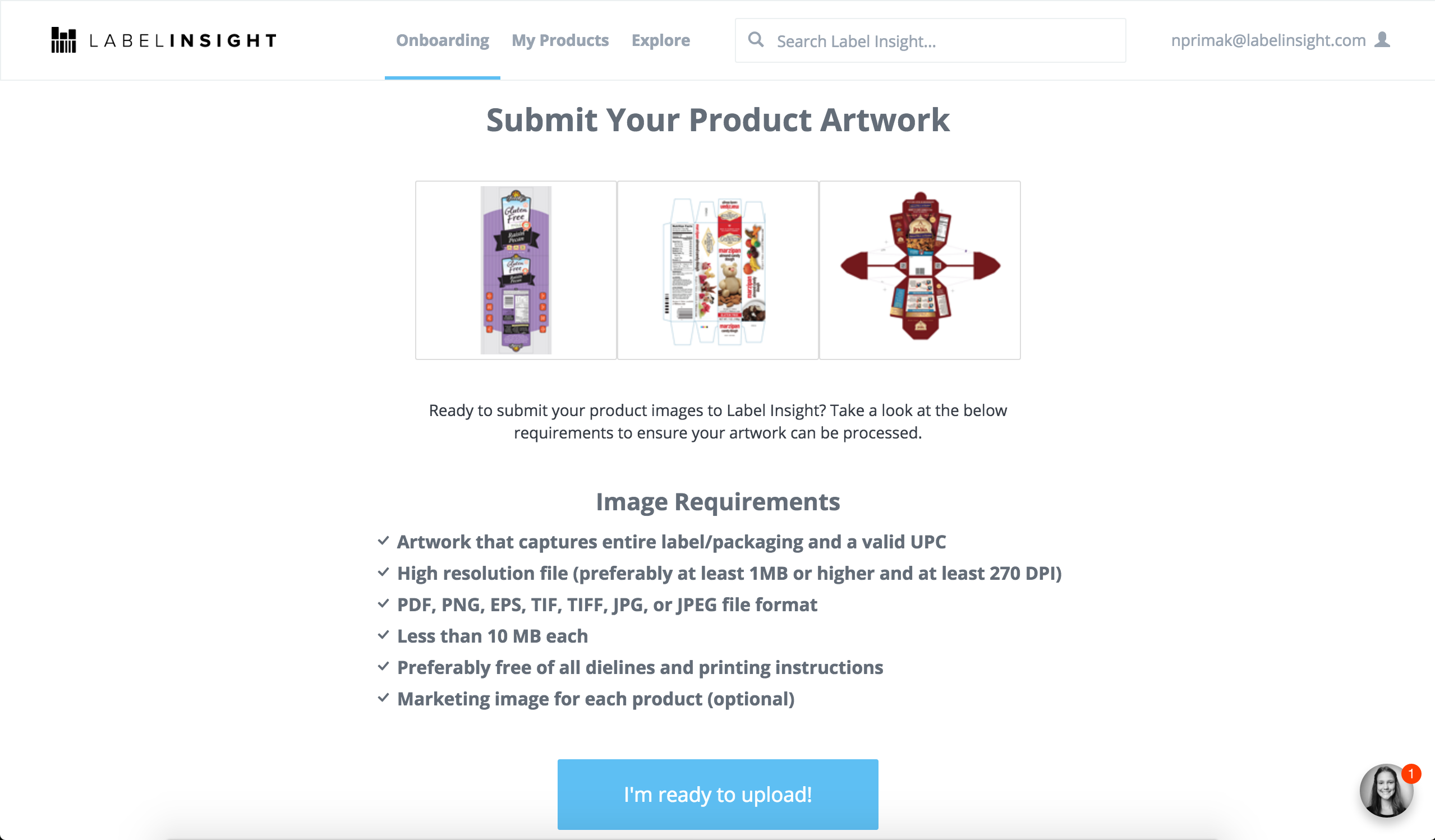
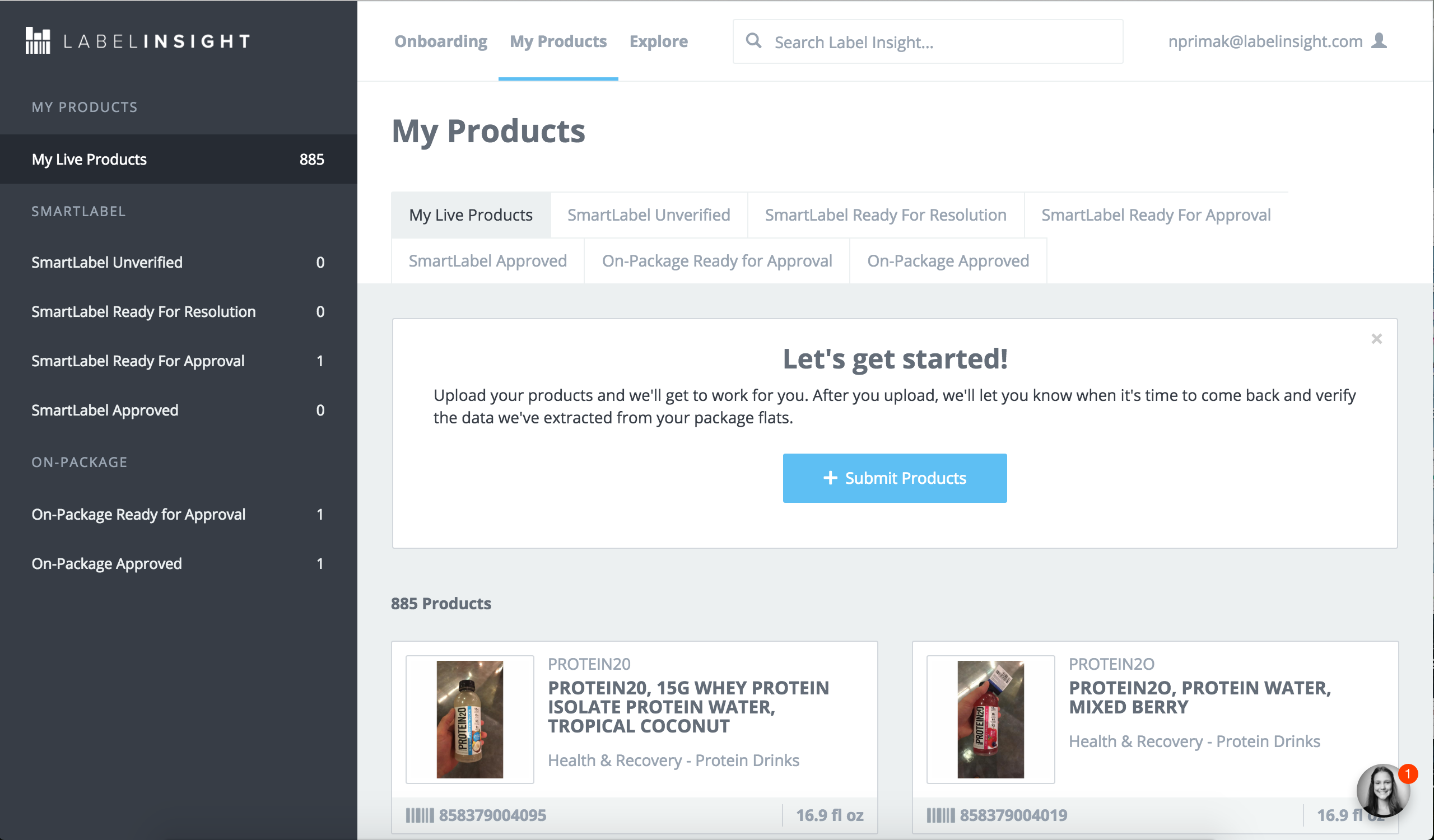
I worked for Label Insight for one year, where I became familiar with a number of their angular applications. Label Insight is a start up that processes and stores giant amounts of data for grocery retailers and food distributors. However, their ultimate goal is to bring all this data to the public to provide transparency around their food products.
During my time at Label Insight I worked on many different projects, from responsive bar charts to browser compatability to entire new angular apps for data quality assurance to be used by our internal team. Working with huge datasets was an everyday affair at Label Insight, and so I had to learn how to process REST API's and create pages dynamically on the fly based on that data. I often juggled programming and CSS tasks, depending on the priorities for the week.

I was contracted by Anheuser-Busch to work on a rapid mobile app prototype with a team of developers. My contribution was primarily UX/UI mockups and programming design tweaks in Xcode. I created the launch image, icons, and overall look and feel of the app. Having no knowledge of Xcode prior to this project, I had to learn on the fly.
The goal of the prototype was to be functional enough to pass on to Anheuser-Busch's internal team of developers. The primary goal of the app was to keep track of liquor licensed bars and restaurants interested in the new Stella Nova Draught countertop bar solution, for marketing purposes. Content is blurred for disclosure policy reasons.

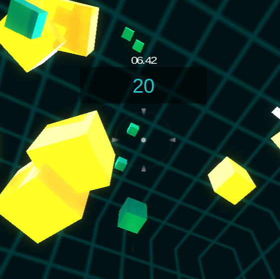
Like Roller Madness, this game was built in part while taking a class on Coursera taught by the University of Michigan. Using Unity, I built my first shooter game where the player's goal is to get as high of a score as possible by shooting the green squares for points and the white squares to increase their time limit. Also similar to Roller Madness, I created Level 1 while following along with the Course material and Level 2 I made it more difficult by increasing the range of distance, making the score boxes move faster, making the yellow boxes which cause you to lose time closer and bigger, and finally making the white squares which gain the player more time smaller and farther away.
Play Now
 Play Now
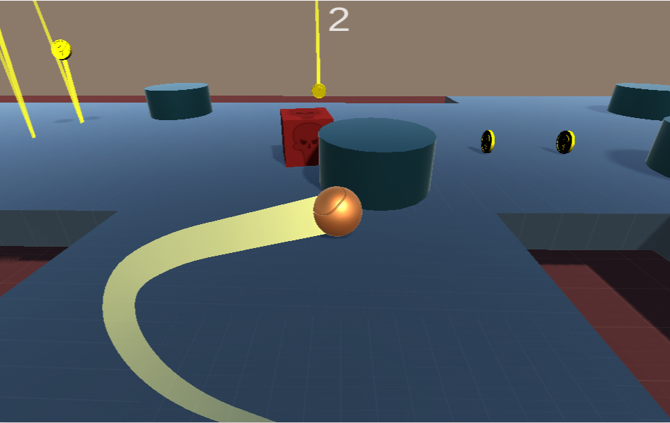
I had wanted to learn Unity for a long time but hadn't taken the plunge until this Coursera certification, taught by University of Michigan came around. This was the first game I made, where Level 1 was primarily following along with the instructor while Level 2 is of my own design. You control the ball with the arrow keys and must avoid falling off the edges or into the holes in the ground. Don't forget to stay away from the squares that are chasing you! Oh, and try to collect as many coins as you can. That is pretty important too.

 Visit the Website
Hnefatafl is an ancient viking game that predates chess. Between jobs I was inspired to tackle an online version of the game when my fiancee sent me an article about it. Growing up I enjoyed chess and I always thought that if I could code a game I would have the confidence to enter the workforce as a programmer.
Friends can also play against each other on the same computer, and the interface is very similar. When I looked at other developers who coded Hnefatafl for online play, I noticed that the game board was very small and it was difficult for beginner players to know where their pieces can move. Since this is not a mainstream game like chess, I felt it was especially important to include that feature.
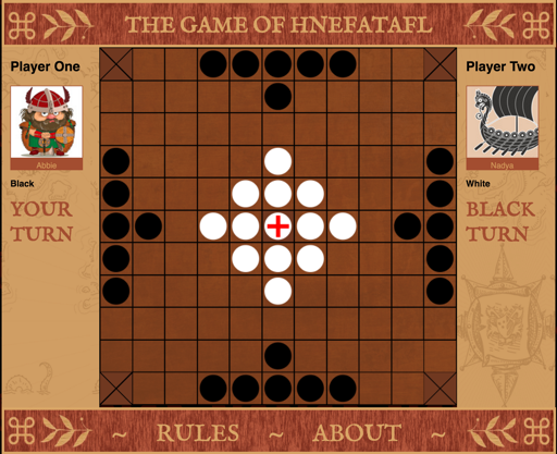
The most challenging aspect of the project was understanding AJAX calls and the tedious testing to make sure both users would see the same game board when playing against each other online. However, it was the last step and I was more than happy to devote those extra hours after experiencing the delight of seeing the pieces move and respond to user interactions.

Since posting the game online I have received many more hits than I was expecting, as many as 70,000 per month. For such an unusual game that few people have ever heard of, I consider this a success. It was a very fun project for me to tackle.
 Play the Game
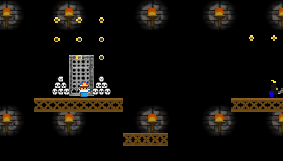
Queen Dungeon Escape is a platformer game that I built for the final assignment in Michigan University's Game Development Certification Program, for the Advanced Techniques curriculum.
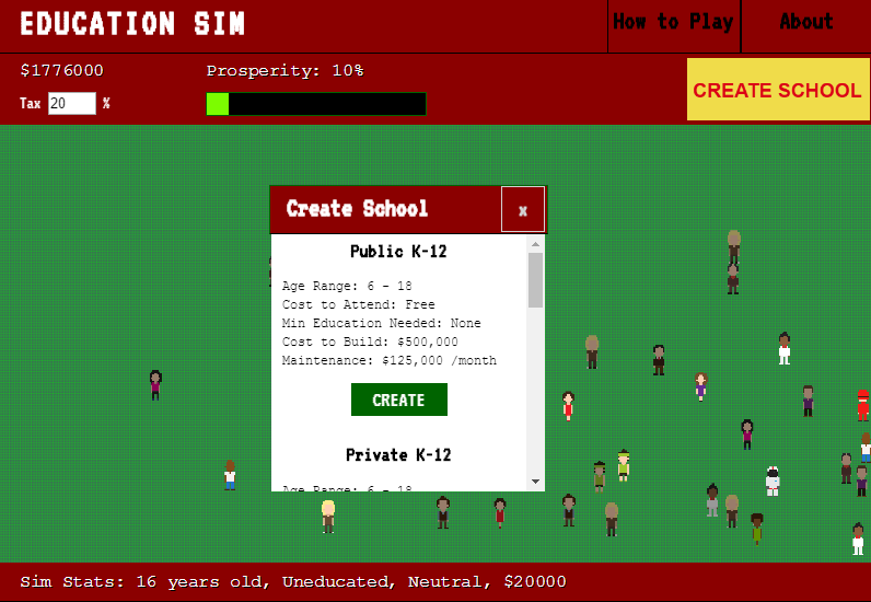
It was different from the other assignments in that we were supposed to build a framework following along with the instructor, but then make customizations to the game to make it our own. I took that part of the assignment to heart, and replaced all of the graphics except for the moving platforms and the knights with my own graphics.
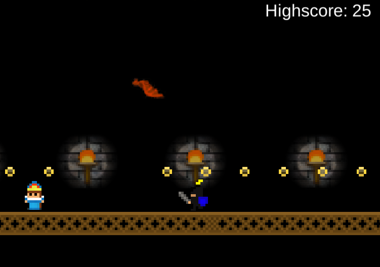
I also wrote some of my own scripts, for example the bats which fly around the world can pick you up, carry you around, and then drop you (possibly to your death). Adding hit damage from falling was another aspect that I scripted.
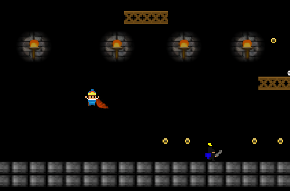
Another important thing I learned during this project was creating animations in Unity. Rather than having a death animation when the queen gets captured by the knights, I decided to show her getting locked up in a cell again.
In the framework for the platformer the character only had one objective, which was to reach an object in the map. I decided to also add an extra layer to the winning mechanic, by having the Queen need to find a key and then get to the door.
All in all this was more challenging than the other Unity projects I did for the Game Development certification, and I may expand this game and add more platformer levels.
 Play the Game
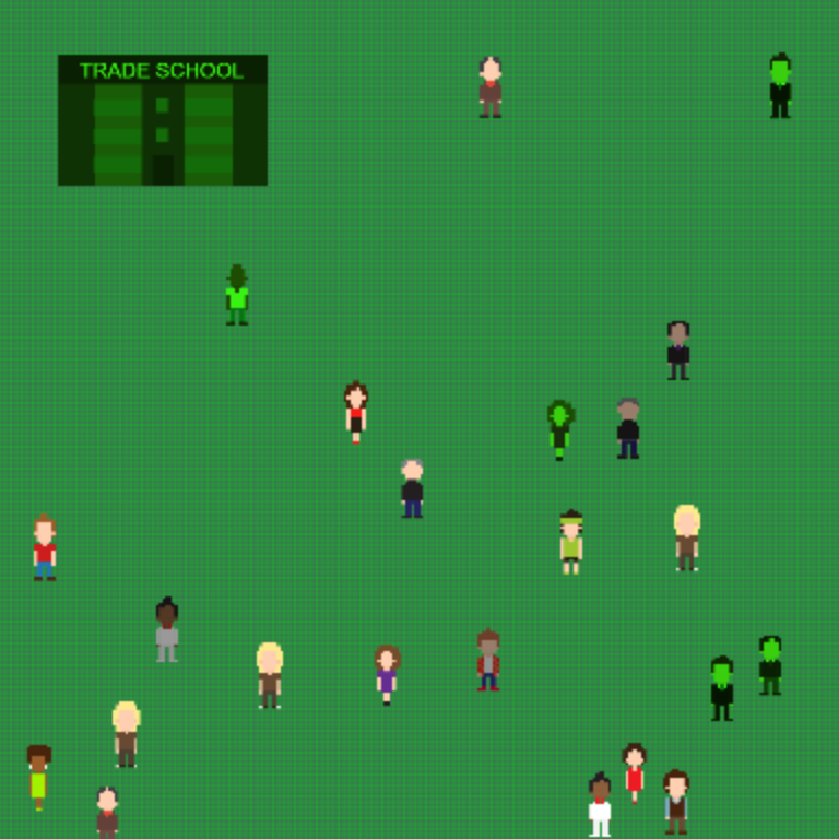
Education Sim was built for the itch.io hosted ResistJam, a game jam for resisting authoritarianism. The issue that I had been wanting to make a statement about for quite some time, particularly since the Betsy Devos nomination, was about education.
I made this game to illustrate how important it is to a society for its population to be educated, and how valuable education can be. However, along the way I decided it also needed to address stereotypes about who is and isn't educated. The fact is, you cannot know how intelligent someone is by simply looking at them.
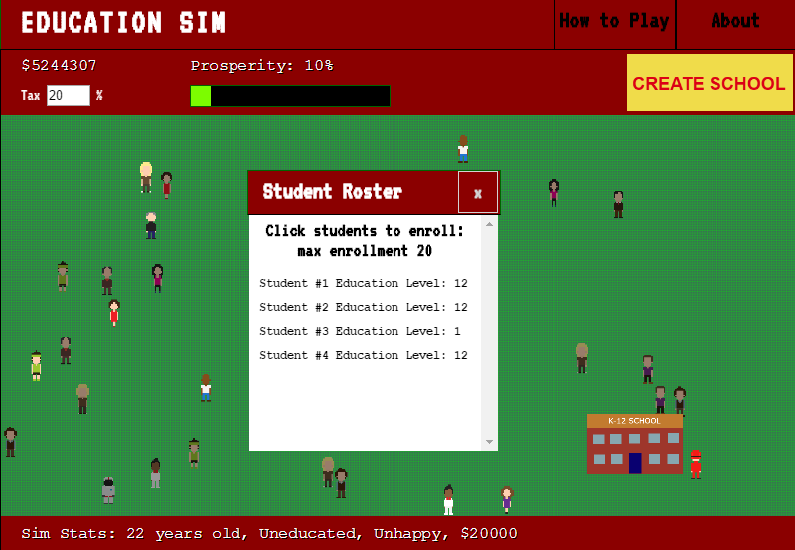
The game becomes challenging for a variety of reasons, but especially because of the economical divides between educated and uneducated people. Although you can increase taxes to your community, this decreases the happiness of individuals and may lead to some (the educated, typically) leaving the community for good. The goal of the game is to reach a prosperity level of 100%, which means your citizens must be happy, employed, and making a good income. Of course, for the citizens who are uneducated, it is much harder to achieve those things, and so you must build schools to help educate your population.
The complexity does not stop there, however. There are different qualities of schools, that cost different amounts for students to attend. Not to mention that different types of schools admit different age ranges of students, and also have different maintenance fees that sap at your income to build additional resources.
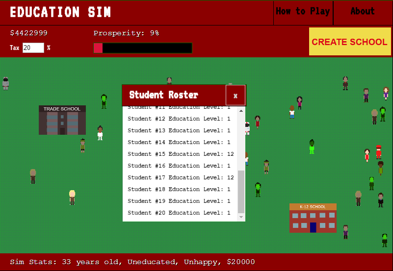
My original intent was not to include quite so many features in the game, but making it only informed me further how important it is for competent people who value education to take the help of prominent seats in government office.
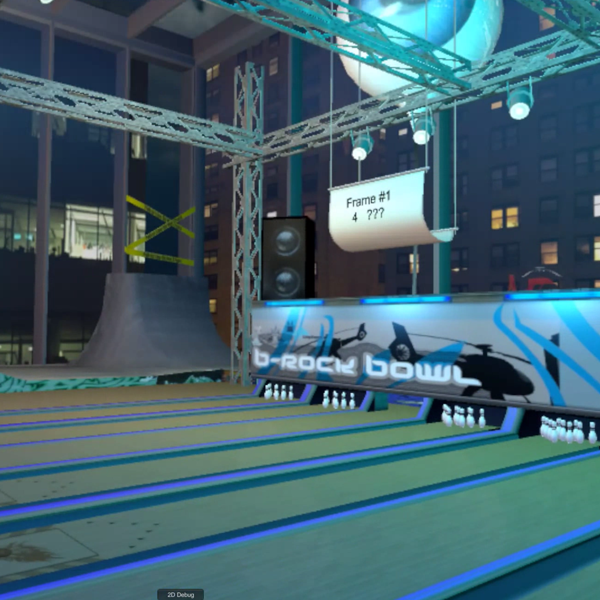
This game is a bowling arcade game built for the HTC Vive. I created it with Unity and the OpenVR Steam SDK. It is my first professional venture into the world of VR development, where I aimed to create a product that I could sell on the Steam marketplace.
While most of the 3D assets for the world were purchased, the 3D bowling pins and ball as well as the collider were custom made in Blender by me for more realistic physics. It was also important to me that the player can see their score, and have it properly counted as in a real game of bowling, with strikes and spares taken into consideration. This introduced a fair amount of complexity, such as respawning the pins every frame and counting the pins that go down.

For my Information Design class as part of my Interaction Design certification, I was tasked to redesign a website of my choice, first making wireframes and then expanding upon them to create the responsive layouts. These included the usual mobile, tablet, and desktop layouts as well as some futuristic layouts (wall, watch).
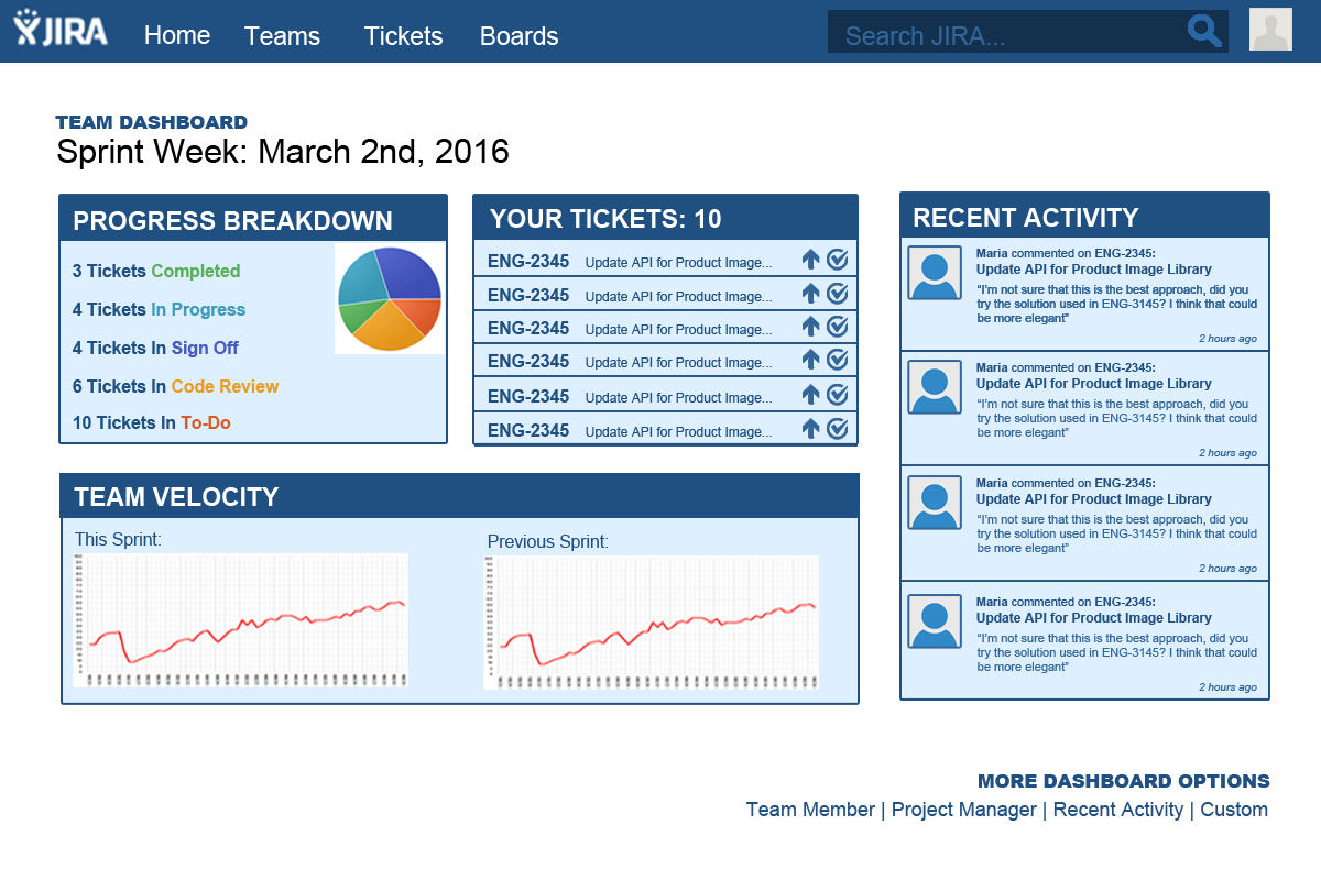
I chose JIRA because I've been working in it everyday for several months now and I find it very unintuitive to use. I think by trying to pack it with every feature they could think of JIRA cluttered up their web app and made it difficult to navigate. So in my designs I tried to simplify things a bit while also holding on to the crucial features that I use on a daily basis in the app.
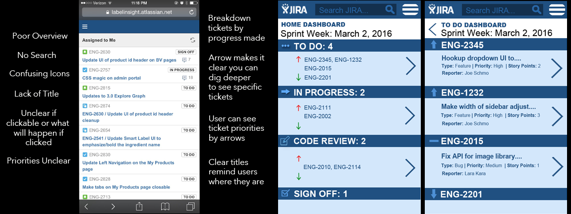
For example, on the mobile app JIRA keeps a lot of the project management features that I think are too complex to execute and navigate on a phone. Also because of that, the crucial ticket and task navigation became harder to find as well. So in my mobile mockup, I focused entirely on improving the display of the tickets and how that could be simplified compared to the current JIRA website.
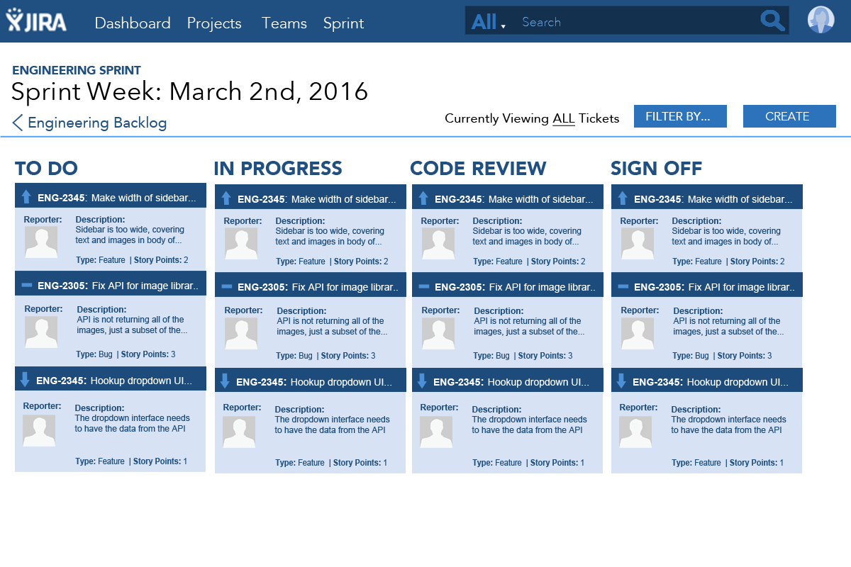
I initially thought it would be too much of a stretch for users to engage with JIRA on a watch or an interactive wall. However, once I really had to start thinking about a design, I realized that a wall could allow for much better improved team meetings if everyone could see their tickets in huge font across the room and literally drag their tickets across the screen when they want to assign them to a user.

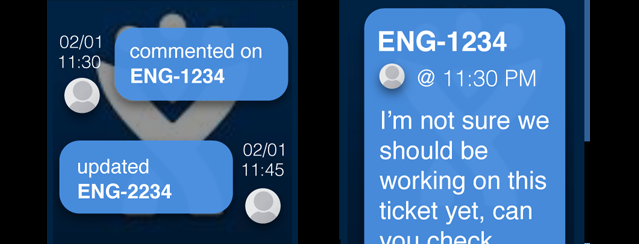
I ultimately ended up changing my mind about the watch as well. While perhaps a watch like the FitBit wouldn't prove much use, a watch the size of an Apple Watch could quickly notify users of new comments and other such minutae that users can easily stay connected without having to constantly check their phone.

I felt like it was time to begin learning React, so I visited Lynda and took a few courses. The one I most recently finished was this bulletin board, or a notes board similar to the desktop notes application many people use to write quick notes on their computer. The application allows you to save, delete, and add new notes. It also dynamically shifts the notes to add that human touch.
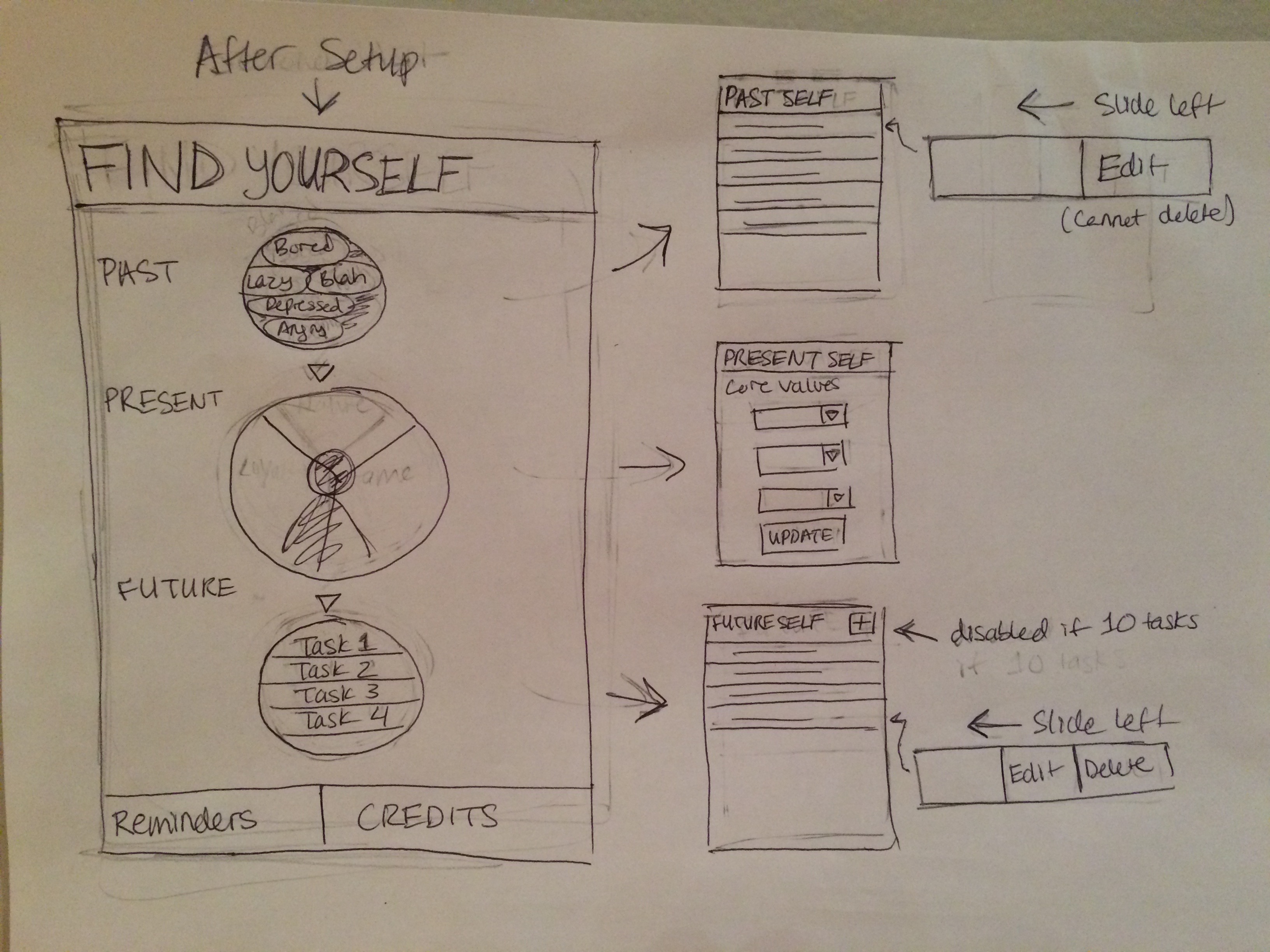
See the App in ActionAs someone who entered the software engineering realm with some design and javascript experience but very little knowledge of user interface design, I felt that it was very important for me to start learning how to design better user interfaces. I decided to enroll in a series of Coursera courses (UC San Diego) teaching Interaction Design, which promised to cover user research, user focused design principles, and more.
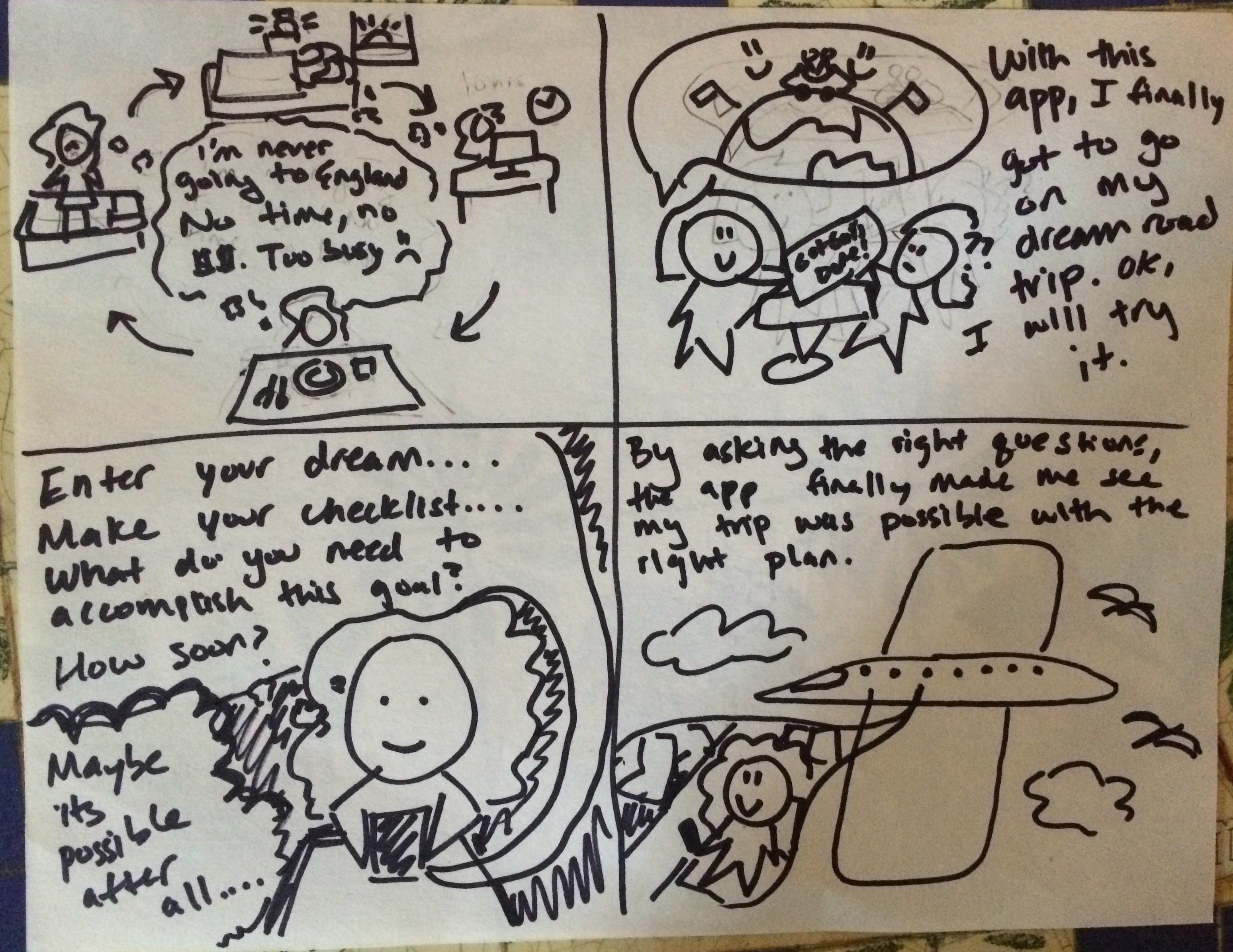
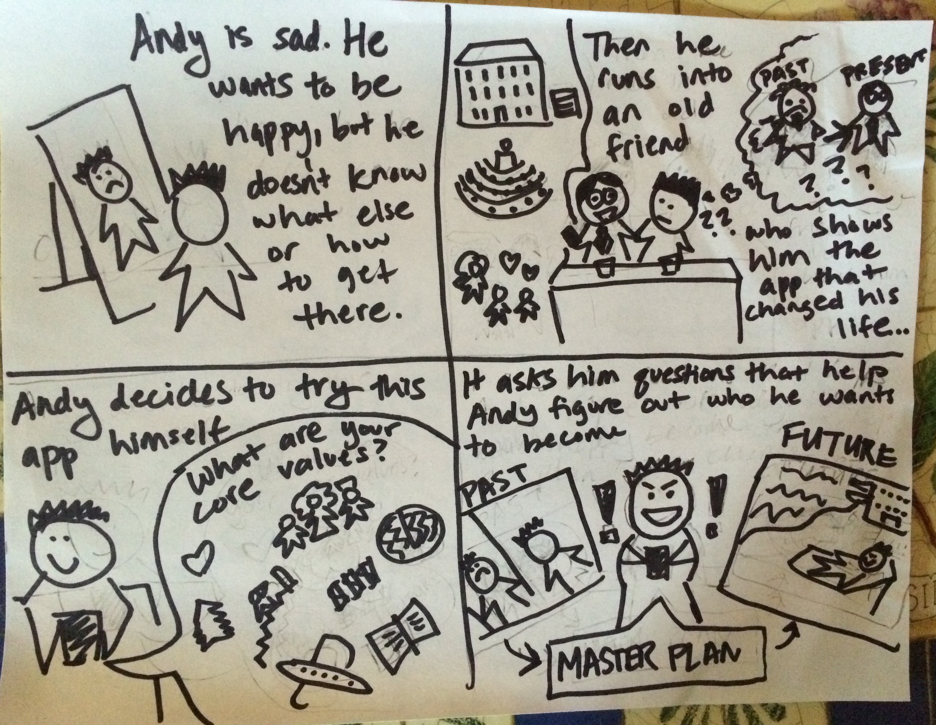
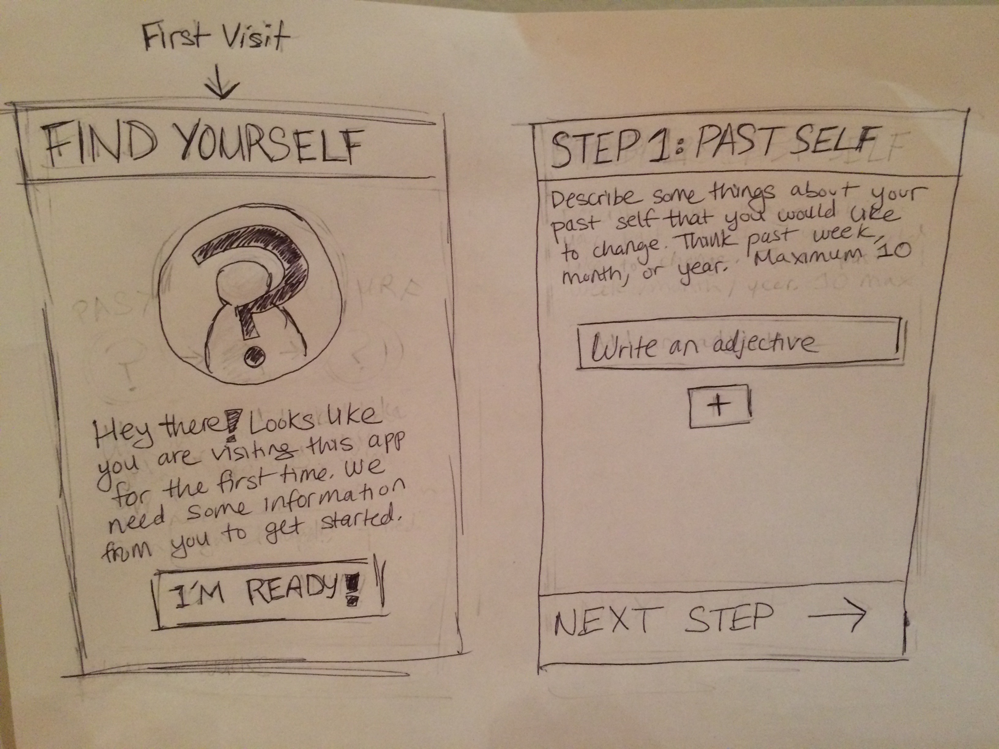
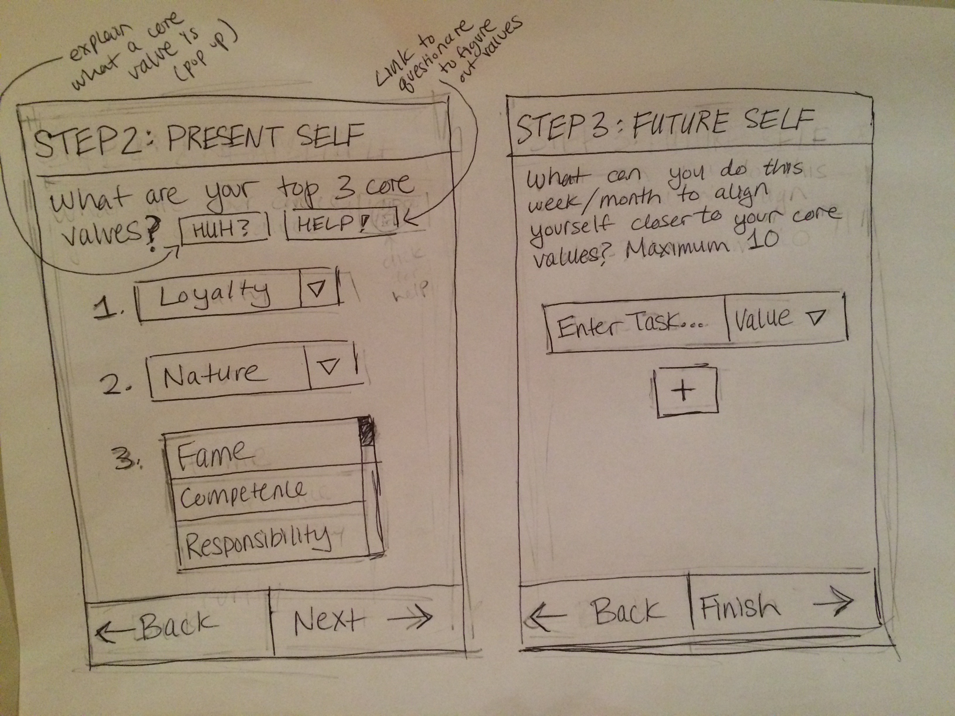
Writing out everything I gleaned from this class would take pages, but the class culminated in a capstone project where we had to design our own mobile app prototype. These steps included brainstorming to find a user need, drawing out storyboards to identify how the need would be met, sketching out a prototype, and finally making this prototype interactive and high fidelity through Invision.
I completed the capstone in January 2017, and wrote a Medium article reflecting on the process. I also have all of the mockups available for download in a PDF below.
Read the Article